Point Patterns
NOTE: some of this material has been ported and adapted from "Lab 9" in Arribas-Bel (2016).
This notebook covers a brief introduction on how to visualize and analyze point patterns. To demonstrate this, we will use a dataset of all the AirBnb listings in the city of Austin (check the Data section for more information about the dataset).
Before anything, let us load up the libraries we will use:
%matplotlib inline

import numpy as np
import pandas as pd
import geopandas as gpd
import seaborn as sns
import matplotlib.pyplot as plt
import mplleaflet as mpll
Data preparation
Let us first set the paths to the datasets we will be using:
# Adjust this to point to the right file in your computer
listings_link = '../data/listings.csv.gz'
The core dataset we will use is listings.csv, which contains a lot of information about each individual location listed at AirBnb within Austin:
lst = pd.read_csv(listings_link)
lst.info()
<class 'pandas.core.frame.DataFrame'>
RangeIndex: 5835 entries, 0 to 5834
Data columns (total 92 columns):
id                                  5835 non-null int64
listing_url                         5835 non-null object
scrape_id                           5835 non-null int64
last_scraped                        5835 non-null object
name                                5835 non-null object
summary                             5373 non-null object
space                               4475 non-null object
description                         5832 non-null object
experiences_offered                 5835 non-null object
neighborhood_overview               3572 non-null object
notes                               2413 non-null object
transit                             3492 non-null object
thumbnail_url                       5542 non-null object
medium_url                          5542 non-null object
picture_url                         5835 non-null object
xl_picture_url                      5542 non-null object
host_id                             5835 non-null int64
host_url                            5835 non-null object
host_name                           5820 non-null object
host_since                          5820 non-null object
host_location                       5810 non-null object
host_about                          3975 non-null object
host_response_time                  4177 non-null object
host_response_rate                  4177 non-null object
host_acceptance_rate                3850 non-null object
host_is_superhost                   5820 non-null object
host_thumbnail_url                  5820 non-null object
host_picture_url                    5820 non-null object
host_neighbourhood                  4977 non-null object
host_listings_count                 5820 non-null float64
host_total_listings_count           5820 non-null float64
host_verifications                  5835 non-null object
host_has_profile_pic                5820 non-null object
host_identity_verified              5820 non-null object
street                              5835 non-null object
neighbourhood                       4800 non-null object
neighbourhood_cleansed              5835 non-null int64
neighbourhood_group_cleansed        0 non-null float64
city                                5835 non-null object
state                               5835 non-null object
zipcode                             5810 non-null float64
market                              5835 non-null object
smart_location                      5835 non-null object
country_code                        5835 non-null object
country                             5835 non-null object
latitude                            5835 non-null float64
longitude                           5835 non-null float64
is_location_exact                   5835 non-null object
property_type                       5835 non-null object
room_type                           5835 non-null object
accommodates                        5835 non-null int64
bathrooms                           5789 non-null float64
bedrooms                            5829 non-null float64
beds                                5812 non-null float64
bed_type                            5835 non-null object
amenities                           5835 non-null object
square_feet                         302 non-null float64
price                               5835 non-null object
weekly_price                        2227 non-null object
monthly_price                       1717 non-null object
security_deposit                    2770 non-null object
cleaning_fee                        3587 non-null object
guests_included                     5835 non-null int64
extra_people                        5835 non-null object
minimum_nights                      5835 non-null int64
maximum_nights                      5835 non-null int64
calendar_updated                    5835 non-null object
has_availability                    5835 non-null object
availability_30                     5835 non-null int64
availability_60                     5835 non-null int64
availability_90                     5835 non-null int64
availability_365                    5835 non-null int64
calendar_last_scraped               5835 non-null object
number_of_reviews                   5835 non-null int64
first_review                        3827 non-null object
last_review                         3829 non-null object
review_scores_rating                3789 non-null float64
review_scores_accuracy              3776 non-null float64
review_scores_cleanliness           3778 non-null float64
review_scores_checkin               3778 non-null float64
review_scores_communication         3778 non-null float64
review_scores_location              3779 non-null float64
review_scores_value                 3778 non-null float64
requires_license                    5835 non-null object
license                             1 non-null float64
jurisdiction_names                  0 non-null float64
instant_bookable                    5835 non-null object
cancellation_policy                 5835 non-null object
require_guest_profile_picture       5835 non-null object
require_guest_phone_verification    5835 non-null object
calculated_host_listings_count      5835 non-null int64
reviews_per_month                   3827 non-null float64
dtypes: float64(20), int64(14), object(58)
memory usage: 4.1+ MB
It turns out that one record displays a very odd location and, for the sake of the illustration, we will remove it:
odd = lst.loc[lst.longitude>-80, ['longitude', 'latitude']]
odd
| longitude | latitude | |
|---|---|---|
| 5832 | -5.093682 | 43.214991 |
lst = lst.drop(odd.index)
Point Visualization
The most straighforward way to get a first glimpse of the distribution of the data is to plot their latitude and longitude:
sns.jointplot?
sns.jointplot(x="longitude", y="latitude", data=lst);
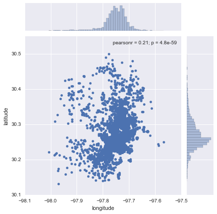
Now this does not neccesarily tell us much about the dataset or the distribution of locations within Austin. There are two main challenges in interpreting the plot: one, there is lack of context, which means the points are not identifiable over space (unless you are so familiar with lon/lat pairs that they have a clear meaning to you); and two, in the center of the plot, there are so many points that it is hard to tell any pattern other than a big blurb of blue.
Let us first focus on the first problem, geographical context. The quickest and easiest way to provide context to this set of points is to overlay a general map. If we had an image with the map or a set of several data sources that we could aggregate to create a map, we could build it from scratch. But in the XXI Century, the easiest is to overlay our point dataset on top of a web map. In this case, we will use Leaflet, and we will convert our underlying matplotlib points with mplleaflet. The full dataset (+5k observations) is a bit too much for leaflet to plot it directly on screen, so we will obtain a random sample of 100 points:
# NOTE: `mpll.display` turned off to be able to compile the website,
#       comment out the last line of this cell for rendering Leaflet map.
rids = np.arange(lst.shape[0])
np.random.shuffle(rids)
f, ax = plt.subplots(1, figsize=(6, 6))
lst.iloc[rids[:100], :].plot(kind='scatter', x='longitude', y='latitude', \
                      s=30, linewidth=0, ax=ax);
mpll.display(fig=f,)
This map allows us to get a much better sense of where the points are and what type of location they might be in. For example, now we can see that the big blue blurb has to do with the urbanized core of Austin.
bokeh alternative
Leaflet is not the only technology to display data on maps, although it is probably the default option in many cases. When the data is larger than "acceptable", we need to resort to more technically sophisticated alternatives. One option is provided by bokeh and its datashaded submodule (see here for a very nice introduction to the library, from where this example has been adapted).
Before we delve into bokeh, let us reproject our original data (lon/lat coordinates) into Web Mercator, as bokeh will expect them. To do that, we turn the coordinates into a GeoSeries:
from shapely.geometry import Point
xys_wb = gpd.GeoSeries(lst[['longitude', 'latitude']].apply(Point, axis=1), \
                      crs="+init=epsg:4326")
xys_wb = xys_wb.to_crs(epsg=3857)
x_wb = xys_wb.apply(lambda i: i.x)
y_wb = xys_wb.apply(lambda i: i.y)
Now we are ready to setup the plot in bokeh:
from bokeh.plotting import figure, output_notebook, show
from bokeh.tile_providers import STAMEN_TERRAIN
output_notebook()

minx, miny, maxx, maxy = xys_wb.total_bounds
y_range = miny, maxy
x_range = minx, maxx

def base_plot(tools='pan,wheel_zoom,reset',plot_width=600, plot_height=400, **plot_args):
    p = figure(tools=tools, plot_width=plot_width, plot_height=plot_height,
        x_range=x_range, y_range=y_range, outline_line_color=None,
        min_border=0, min_border_left=0, min_border_right=0,
        min_border_top=0, min_border_bottom=0, **plot_args)

    p.axis.visible = False
    p.xgrid.grid_line_color = None
    p.ygrid.grid_line_color = None
    return p

options = dict(line_color=None, fill_color='#800080', size=4)
<div class="bk-banner">
    <a href="http://bokeh.pydata.org" target="_blank" class="bk-logo bk-logo-small bk-logo-notebook"></a>
    <span id="efa98bda-2ccf-4dbf-ae97-94033d60c79b">Loading BokehJS ...</span>
</div>
And good to go for mapping!
# NOTE: `show` turned off to be able to compile the website,
#       comment out the last line of this cell for rendering.
p = base_plot()
p.add_tile(STAMEN_TERRAIN)
p.circle(x=x_wb, y=y_wb, **options)
#show(p)
<bokeh.models.renderers.GlyphRenderer at 0x1052bb5f8>
As you can quickly see, bokeh is substantially faster at rendering larger amounts of data.
The second problem we have spotted with the first scatter is that, when the number of points grows, at some point it becomes impossible to discern anything other than a big blur of color. To some extent, interactivity gets at that problem by allowing the user to zoom in until every point is an entity on its own. However, there exist techniques that allow to summarize the data to be able to capture the overall pattern at once. Traditionally, kernel density estimation (KDE) has been one of the most common solutions by approximating a continuous surface of point intensity. In this context, however, we will explore a more recent alternative suggested by the datashader library (see the paper if interested in more details).
Arguably, our dataset is not large enough to justify the use of a reduction technique like datashader, but we will create the plot for the sake of the illustration. Keep in mind, the usefulness of this approach increases the more points you need to be plotting.
# NOTE: `show` turned off to be able to compile the website,
#       comment out the last line of this cell for rendering.

import datashader as ds
from datashader.callbacks import InteractiveImage
from datashader.colors import viridis
from datashader import transfer_functions as tf
from bokeh.tile_providers import STAMEN_TONER

p = base_plot()
p.add_tile(STAMEN_TONER)

pts = pd.DataFrame({'x': x_wb, 'y': y_wb})
pts['count'] = 1
def create_image90(x_range, y_range, w, h):
    cvs = ds.Canvas(plot_width=w, plot_height=h, x_range=x_range, y_range=y_range)
    agg = cvs.points(pts, 'x', 'y',  ds.count('count'))
    img = tf.interpolate(agg.where(agg > np.percentile(agg,90)), \
                         cmap=viridis, how='eq_hist')
    return tf.dynspread(img, threshold=0.1, max_px=4)

#InteractiveImage(p, create_image90)
The key advandage of datashader is that is decouples the point processing from the plotting. That is the bit that allows it to be scalable to truly large datasets (e.g. millions of points). Essentially, the approach is based on generating a very fine grid, counting points within pixels, and encoding the count into a color scheme. In our map, this is not particularly effective because we do not have too many points (the previous plot is probably a more effective one) and esssentially there is a pixel per location of every point. However, hopefully this example shows how to create this kind of scalable maps.
Kernel Density Estimation
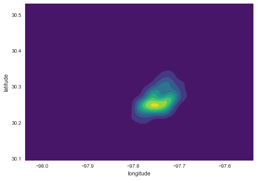
A common alternative when the number of points grows is to replace plotting every single point by estimating the continuous observed probability distribution. In this case, we will not be visualizing the points themselves, but an abstracted surface that models the probability of point density over space. The most commonly used method to do this is the so called kernel density estimate (KDE). The idea behind KDEs is to count the number of points in a continious way. Instead of using discrete counting, where you include a point in the count if it is inside a certain boundary and ignore it otherwise, KDEs use functions (kernels) that include points but give different weights to each one depending of how far of the location where we are counting the point is.
Creating a KDE is very straightfoward in Python. In its simplest form, we can run the following single line of code:
sns.kdeplot(lst['longitude'], lst['latitude'], shade=True, cmap='viridis');
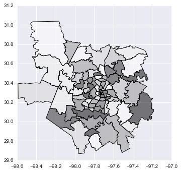
Now, if we want to include additional layers of data to provide context, we can do so in the same way we would layer up different elements in matplotlib. Let us load first the Zip codes in Austin, for example:
zc = gpd.read_file('../data/Zipcodes.geojson')
zc.plot();
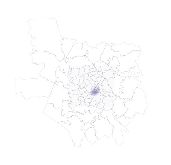
And, to overlay both layers:
f, ax = plt.subplots(1, figsize=(9, 9))

zc.plot(color='white', linewidth=0.1, ax=ax)

sns.kdeplot(lst['longitude'], lst['latitude'], \
            shade=True, cmap='Purples', \
            ax=ax);

ax.set_axis_off()
plt.axis('equal')
plt.show()
Exercise
Split the dataset by type of property and create a map for the five most common types.
Consider the following sorting of property types:
lst.property_type.groupby(lst.property_type)\
                 .count()\
                 .sort_values(ascending=False)
property_type
House              3549
Apartment          1855
Condominium         106
Loft                 83
Townhouse            57
Other                47
Bed & Breakfast      37
Camper/RV            34
Bungalow             18
Cabin                17
Tent                 11
Villa                 7
Treehouse             7
Earth House           2
Chalet                1
Hut                   1
Boat                  1
Tipi                  1
Name: property_type, dtype: int64