Hands-on#
Mapping in Python#
import geopandas
import osmnx
import contextily as cx
import matplotlib.pyplot as plt
/tmp/ipykernel_7827/2961306976.py:1: UserWarning: Shapely 2.0 is installed, but because PyGEOS is also installed, GeoPandas will still use PyGEOS by default for now. To force to use and test Shapely 2.0, you have to set the environment variable USE_PYGEOS=0. You can do this before starting the Python process, or in your code before importing geopandas:
import os
os.environ['USE_PYGEOS'] = '0'
import geopandas
In a future release, GeoPandas will switch to using Shapely by default. If you are using PyGEOS directly (calling PyGEOS functions on geometries from GeoPandas), this will then stop working and you are encouraged to migrate from PyGEOS to Shapely 2.0 (https://shapely.readthedocs.io/en/latest/migration_pygeos.html).
import geopandas
In this lab, we will learn how to load, manipulate and visualize spatial data. In some senses, spatial data are usually included simply as “one more column” in a table. However, spatial is special sometimes and there are few aspects in which geographic data differ from standard numerical tables. In this session, we will extend the skills developed in the previous one about non-spatial data, and combine them. In the process, we will discover that, although with some particularities, dealing with spatial data in Python largely resembles dealing with non-spatial data.
Datasets#
To learn these concepts, we will be playing with three main datasets. Same as in the previous block, these datasets can be loaded dynamically from the web, or you can download them manually, keep a copy on your computer, and load them from there.
Important
Make sure you are connected to the internet when you run these cells as they need to access data hosted online
Cities#
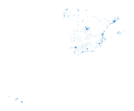
First we will use a polygon geography. We will use an open dataset that contains the boundaries of Spanish cities. We can read it into an object named cities by:
cities = geopandas.read_file("https://ndownloader.figshare.com/files/20232174")
Note the code cell above requires internet connectivity. If you are not online but have a full copy of the GDS course in your computer (downloaded as suggested in the infrastructure page), you can read the data with the following line of code:
cities = geopandas.read_file("../data/web_cache/cities.gpkg")
Streets#
In addition to polygons, we will play with a line layer. For that, we are going to use a subset of street network from the Spanish city of Madrid.
The data is available on the following web address:
url = (
"https://github.com/geochicasosm/lascallesdelasmujeres"
"/raw/master/data/madrid/final_tile.geojson"
)
url
'https://github.com/geochicasosm/lascallesdelasmujeres/raw/master/data/madrid/final_tile.geojson'
And you can read it into an object called streets with:
streets = geopandas.read_file(url)
Note the code cell above requires internet connectivity. If you are not online but have a full copy of the GDS course in your computer (downloaded as suggested in the infrastructure page), you can read the data with the following line of code:
streets = geopandas.read_file("../data/web_cache/streets.gpkg")
Bars#
The final dataset we will rely on is a set of points demarcating the location of bars in Madrid. To obtain it, we will use osmnx, a Python library that allows us to query OpenStreetMap. Note that we use the method pois_from_place, which queries for points of interest (POIs, or pois) in a particular place (Madrid in this case). In addition, we can specify a set of tags to delimit the query. We use this to ask only for amenities of the type “bar”:
pois = osmnx.geometries_from_place(
"Madrid, Spain", tags={"amenity": "bar"}
)
Attention
If you are using an old version of osmnx (<1.0), replace the code in the cell above for:
pubs = osmnx.pois.pois_from_place(
"Liverpool, UK", tags={"amenity": "bar"}
)
You can check the version you are using with the following snipet:
osmnx.__version__
You do not need to know at this point what happens behind the scenes when we run geometries_from_place but, if you are curious, we are making a query to OpenStreetMap (almost as if you typed “bars in Madrid, Spain” within Google Maps) and getting the response as a table of data, instead of as a website with an interactive map. Pretty cool, huh?
Note the code cell above requires internet connectivity. If you are not online but have a full copy of the GDS course in your computer (downloaded as suggested in the infrastructure page), you can read the data with the following line of code:
pois = geopandas.read_parquet("../data/web_cache/pois_bars_madrid.parquet")
Inspecting spatial data#
The most direct way to get from a file to a quick visualization of the data is by loading it as a GeoDataFrame and calling the plot command. The main library employed for all of this is geopandas which is a geospatial extension of the pandas library, already introduced before. geopandas supports the same functionality that pandas does, plus a wide range of spatial extensions that make manipulation and general “munging” of spatial data similar to non-spatial tables.
In two lines of code, we will obtain a graphical representation of the spatial data contained in a file that can be in many formats; actually, since it uses the same drivers under the hood, you can load pretty much the same kind of vector files that Desktop GIS packages like QGIS permit. Let us start by plotting single layers in a crude but quick form, and we will build style and sophistication into our plots later on.
Polygons#
Now lsoas is a GeoDataFrame. Very similar to a traditional, non-spatial DataFrame, but with an additional column called geometry:
cities.head()
| city_id | n_building | geometry | |
|---|---|---|---|
| 0 | ci000 | 2348 | POLYGON ((385390.071 4202949.446, 384488.697 4... |
| 1 | ci001 | 2741 | POLYGON ((214893.033 4579137.558, 215258.185 4... |
| 2 | ci002 | 5472 | POLYGON ((690674.281 4182188.538, 691047.526 4... |
| 3 | ci003 | 14608 | POLYGON ((513378.282 4072327.639, 513408.853 4... |
| 4 | ci004 | 2324 | POLYGON ((206989.081 4129478.031, 207275.702 4... |
This allows us to quickly produce a plot by executing the following line:
cities.plot()
<Axes: >
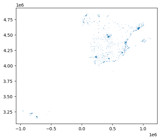
This might not be the most aesthetically pleasant visual representation of the LSOAs geography, but it is hard to argue it is not quick to produce. We will work on styling and customizing spatial plots later on.
Pro-tip: if you call a single row of the geometry column, it’ll return a small plot ith the shape:
cities.loc[0, 'geometry']

Lines#
Similarly to the polygon case, if we pick the "geometry" column of a table with lines, a single row will display the geometry as well:
streets.loc[0, 'geometry']

A quick plot is similarly generated by:
streets.plot()
<Axes: >
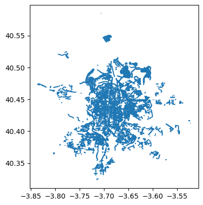
Again, this is not the prettiest way to display the streets maybe, and you might want to change a few parameters such as colors, etc. All of this is possible, as we will see below, but this gives us a quick check of what lines look like.
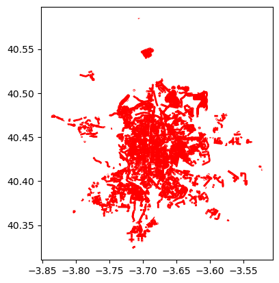
Points#
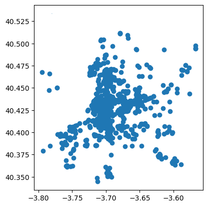
Points take a similar approach for quick plotting:
pois.plot()
<Axes: >
Styling plots#
It is possible to tweak several aspects of a plot to customize if to particular needs. In this section, we will explore some of the basic elements that will allow us to obtain more compelling maps.
NOTE: some of these variations are very straightforward while others are more intricate and require tinkering with the internal parts of a plot. They are not necessarily organized by increasing level of complexity.
Changing transparency#
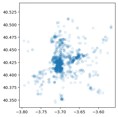
The intensity of color of a polygon can be easily changed through the alpha attribute in plot. This is specified as a value betwee zero and one, where the former is entirely transparent while the latter is the fully opaque (maximum intensity):
pois.plot(alpha=0.1)
<Axes: >
Removing axes#
Although in some cases, the axes can be useful to obtain context, most of the times maps look and feel better without them. Removing the axes involves wrapping the plot into a figure, which takes a few more lines of aparently useless code but that, in time, it will allow you to tweak the map further and to create much more flexible designs:
# Setup figure and axis
f, ax = plt.subplots(1)
# Plot layer of polygons on the axis
cities.plot(ax=ax)
# Remove axis frames
ax.set_axis_off()
# Display
plt.show()
Let us stop for a second a study each of the previous lines:
We have first created a figure named
fwith one axis namedaxby using the commandplt.subplots(part of the librarymatplotlib, which we have imported at the top of the notebook). Note how the method is returning two elements and we can assign each of them to objects with different name (fandax) by simply listing them at the front of the line, separated by commas.Second, we plot the geographies as before, but this time we tell the function that we want it to draw the polygons on the axis we are passing,
ax. This method returns the axis with the geographies in them, so we make sure to store it on an object with the same name,ax.On the third line, we effectively remove the box with coordinates.
Finally, we draw the entire plot by calling
plt.show().
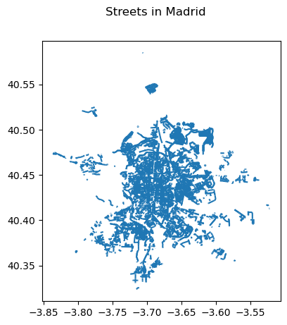
Adding a title#
Adding a title is an extra line, if we are creating the plot within a figure, as we just did. To include text on top of the figure:
# Setup figure and axis
f, ax = plt.subplots(1)
# Add layer of polygons on the axis
streets.plot(ax=ax)
# Add figure title
f.suptitle("Streets in Madrid")
# Display
plt.show()
Changing the size of the map#
The size of the plot is changed equally easily in this context. The only difference is that it is specified when we create the figure with the argument figsize. The first number represents the width, the X axis, and the second corresponds with the height, the Y axis.
# Setup figure and axis with different size
f, ax = plt.subplots(1, figsize=(12, 12))
# Add layer of polygons on the axis
cities.plot(ax=ax)
# Display
plt.show()
Modifying borders#
Border lines sometimes can distort or impede proper interpretation of a map. In those cases, it is useful to know how they can be modified. Although not too complicated, the way to access borders in geopandas is not as straightforward as it is the case for other aspects of the map, such as size or frame. Let us first see the code to make the lines thicker and black, and then we will work our way through the different steps:
# Setup figure and axis
f, ax = plt.subplots(1, figsize=(12, 12))
# Add layer of polygons on the axis, set fill color (`facecolor`) and boundary
# color (`edgecolor`)
cities.plot(
linewidth=1,
facecolor='red',
edgecolor='black',
ax=ax
);
Note how the lines are thicker. In addition, all the polygons are colored in the same (default) color, light red. However, because the lines are thicker, we can only see the polygon filling for those cities with an area large enough.
Let us examine line by line what we are doing in the code snippet:
We begin by creating the figure (
f) object and one axis inside it (ax) where we will plot the map.Then, we call
plotas usual, but pass in two new arguments:linewidthfor the width of the line;facecolor, to control the color each polygon is filled with; andedgecolor, to control the color of the boundary.
This approach works very similarly with other geometries, such as lines. For example, if we wanted to plot the streets in red, we would simply:
# Setup figure and axis
f, ax = plt.subplots(1)
# Add layer with lines, set them red and with different line width
# and append it to the axis `ax`
streets.plot(linewidth=2, color='red', ax=ax)
<Axes: >
Important, note that in the case of lines the parameter to control the color is simply color. This is because lines do not have an area, so there is no need to distinguish between the main area (facecolor) and the border lines (edgecolor).
Transforming CRS#
The coordindate reference system (CRS) is the way geographers and cartographers have to represent a three-dimentional object, such as the round earth, on a two-dimensional plane, such as a piece of paper or a computer screen. If the source data contain information on the CRS of the data, we can modify this in a GeoDataFrame. First let us check if we have the information stored properly:
cities.crs
<Projected CRS: EPSG:25830>
Name: ETRS89 / UTM zone 30N
Axis Info [cartesian]:
- E[east]: Easting (metre)
- N[north]: Northing (metre)
Area of Use:
- name: Europe between 6°W and 0°W: Faroe Islands offshore; Ireland - offshore; Jan Mayen - offshore; Norway including Svalbard - offshore; Spain - onshore and offshore.
- bounds: (-6.0, 35.26, 0.01, 80.49)
Coordinate Operation:
- name: UTM zone 30N
- method: Transverse Mercator
Datum: European Terrestrial Reference System 1989 ensemble
- Ellipsoid: GRS 1980
- Prime Meridian: Greenwich
As we can see, there is information stored about the reference system: it is using the standard Spanish projection, which is expressed in meters. There are also other less decipherable parameters but we do not need to worry about them right now.
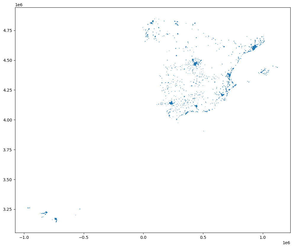
If we want to modify this and “reproject” the polygons into a different CRS, the quickest way is to find the EPSG code online (epsg.io is a good one, although there are others too). For example, if we wanted to transform the dataset into lat/lon coordinates, we would use its EPSG code, 4326:
# Reproject (`to_crs`) and plot (`plot`) polygons
cities.to_crs(epsg=4326).plot()
# Set equal axis
lims = plt.axis('equal')
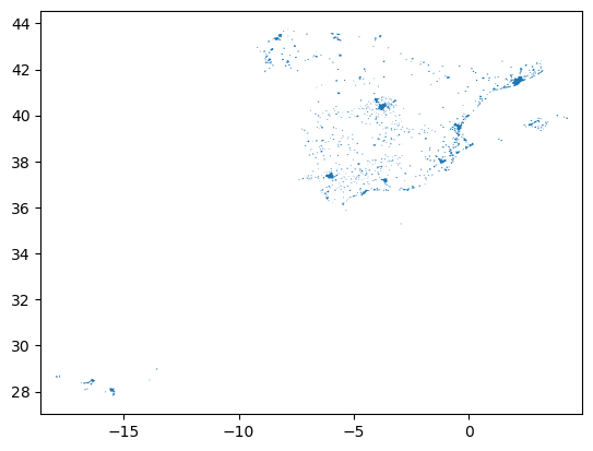
The shape of the polygons is slightly different. Furthermore, note how the scale in which they are plotted differs.
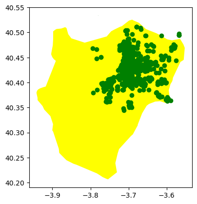
Composing multi-layer maps#
So far we have considered many aspects of plotting a single layer of data. However, in many cases, an effective map will require more than one: for example we might want to display streets on top of the polygons of neighborhoods, and add a few points for specific locations we want to highlight. At the very heart of GIS is the possibility to combine spatial information from different sources by overlaying it on top of each other, and this is fully supported in Python.
For this section, let’s select only Madrid from the streets table and convert it to lat/lon so it’s aligned with the streets and POIs layers:
mad = cities.loc[[12], :].to_crs(epsg=4326)
mad
| city_id | n_building | geometry | |
|---|---|---|---|
| 12 | ci012 | 193714 | POLYGON ((-3.90016 40.30421, -3.90019 40.30457... |
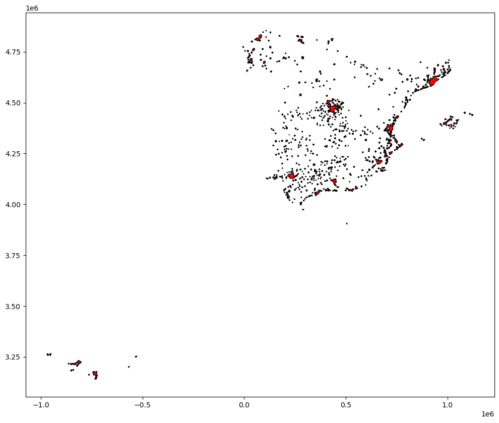
Combining different layers on a single map boils down to adding each of them to the same axis in a sequential way, as if we were literally overlaying one on top of the previous one. For example, let’s plot the boundary of Madrid and its bars:
# Setup figure and axis
f, ax = plt.subplots(1)
# Add a layer with polygon on to axis `ax`
mad.plot(ax=ax, color="yellow")
# Add a layer with lines on top in axis `ax`
pois.plot(ax=ax, color="green")
<Axes: >
Saving maps to figures#
Once we have produced a map we are content with, we might want to save it to a file so we can include it into a report, article, website, etc. Exporting maps in Python involves replacing plt.show by plt.savefig at the end of the code block to specify where and how to save it. For example to save the previous map into a png file in the same folder where the notebook is hosted:
# Setup figure and axis
f, ax = plt.subplots(1)
# Add a layer with polygon on to axis `ax`
mad.plot(ax=ax, color="yellow")
# Add a layer with lines on top in axis `ax`
pois.plot(ax=ax, color="green")
# Save figure to a PNG file
plt.savefig('madrid_bars.png')
If you now check on the folder, you’ll find a png (image) file with the map.
The command plt.savefig contains a large number of options and additional parameters to tweak. Given the size of the figure created is not very large, we can increase this with the argument dpi, which stands for “dots per inch” and it’s a standard measure of resolution in images. For example, for a high quality image, we could use 500:
# Setup figure and axis
f, ax = plt.subplots(1)
# Add a layer with polygon on to axis `ax`
mad.plot(ax=ax, color="yellow")
# Add a layer with lines on top in axis `ax`
pois.plot(ax=ax, color="green")
# Save figure to a PNG file
plt.savefig('madrid_bars.png', dpi=500)
Manipulating spatial tables (GeoDataFrames)#
Once we have an understanding of how to visually display spatial information contained, let us see how it can be combined with the operations learnt in the previous session about manipulating non-spatial tabular data. Essentially, the key is to realize that a GeoDataFrame contains most of its spatial information in a single column named geometry, but the rest of it looks and behaves exactly like a non-spatial DataFrame (in fact, it is). This concedes them all the flexibility and convenience that we saw in manipulating, slicing, and transforming tabular data, with the bonus that spatial data is carried away in all those steps. In addition, GeoDataFrames also incorporate a set of explicitly spatial operations to combine and transform data. In this section, we will consider both.
GeoDataFrames come with a whole range of traditional GIS operations built-in. Here we will run through a small subset of them that contains some of the most commonly used ones.
Area calculation#
One of the spatial aspects we often need from polygons is their area. “How big is it?” is a question that always haunts us when we think of countries, regions, or cities. To obtain area measurements, first make sure you GeoDataFrame is projected. If that is the case, you can calculate areas as follows:
city_areas = cities.area
city_areas.head()
0 8.449666e+06
1 9.121270e+06
2 1.322653e+07
3 6.808121e+07
4 1.072284e+07
dtype: float64
This indicates that the area of the first city in our table takes up 8,450,000 squared metres. If we wanted to convert into squared kilometres, we can divide by 1,000,000:
areas_in_sqkm = city_areas / 1000000
areas_in_sqkm.head()
0 8.449666
1 9.121270
2 13.226528
3 68.081212
4 10.722843
dtype: float64
Length#
Similarly, an equally common question with lines is their length. Also similarly, their computation is relatively straightforward in Python, provided that our data are projected. Here we will perform the projection (to_crs) and the calculation of the length at the same time:
street_length = streets.to_crs(epsg=25830).length
street_length.head()
0 120.776840
1 120.902920
2 396.494357
3 152.442895
4 101.392357
dtype: float64
Since the CRS we use (EPSG:25830) is expressed in metres, we can tell the first street segment is about 37m.
Centroid calculation#
Sometimes it is useful to summarize a polygon into a single point and, for that, a good candidate is its centroid (almost like a spatial analogue of the average). The following command will return a GeoSeries (a single column with spatial data) with the centroids of a polygon GeoDataFrame:
cents = cities.centroid
cents.head()
0 POINT (386147.759 4204605.994)
1 POINT (216296.159 4579397.331)
2 POINT (688901.588 4180201.774)
3 POINT (518262.028 4069898.674)
4 POINT (206940.936 4127361.966)
dtype: geometry
Note how cents is not an entire table but a single column, or a GeoSeries object. This means you can plot it directly, just like a table:
cents.plot()
<Axes: >
But you don’t need to call a geometry column to inspect the spatial objects. In fact, if you do it will return an error because there is not any geometry column, the object cents itself is the geometry.
Point in polygon (PiP)#
Knowing whether a point is inside a polygon is conceptually a straightforward exercise but computationally a tricky task to perform. The way to perform this operation in GeoPandas is through the contains method, available for each polygon object.
poly = cities.loc[12, "geometry"]
pt1 = cents[0]
pt2 = cents[112]
And we can perform the checks as follows:
poly.contains(pt1)
False
poly.contains(pt2)
False
Performing point-in-polygon in this way is instructive and useful for pedagogical reasons, but for cases with many points and polygons, it is not particularly efficient. In these situations, it is much more advisable to perform then as a “spatial join”. If you are interested in these, see the link provided below to learn more about them.
Buffers#
Buffers are one of the classical GIS operations in which an area is drawn around a particular geometry, given a specific radious. These are very useful, for instance, in combination with point-in-polygon operations to calculate accessibility, catchment areas, etc.
For this example, we will use the bars table, but will project it to the same CRS as cities, so it is expressed in metres:
pois_projected = pois.to_crs(cities.crs)
pois_projected.crs
<Projected CRS: EPSG:25830>
Name: ETRS89 / UTM zone 30N
Axis Info [cartesian]:
- E[east]: Easting (metre)
- N[north]: Northing (metre)
Area of Use:
- name: Europe between 6°W and 0°W: Faroe Islands offshore; Ireland - offshore; Jan Mayen - offshore; Norway including Svalbard - offshore; Spain - onshore and offshore.
- bounds: (-6.0, 35.26, 0.01, 80.49)
Coordinate Operation:
- name: UTM zone 30N
- method: Transverse Mercator
Datum: European Terrestrial Reference System 1989 ensemble
- Ellipsoid: GRS 1980
- Prime Meridian: Greenwich
To create a buffer using geopandas, simply call the buffer method, passing in the radious. For example, to draw a 500m. buffer around every bar in Madrid:
buf = pois_projected.buffer(500)
buf.head()
0 POLYGON ((440085.759 4475244.528, 440083.352 4...
1 POLYGON ((441199.443 4482099.370, 441197.035 4...
2 POLYGON ((440012.154 4473848.877, 440009.747 4...
3 POLYGON ((441631.862 4473439.094, 441629.454 4...
4 POLYGON ((441283.067 4473680.493, 441280.659 4...
dtype: geometry
And plotting it is equally straighforward:
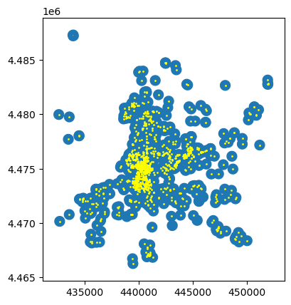
f, ax = plt.subplots(1)
# Plot buffer
buf.plot(ax=ax, linewidth=0)
# Plot named places on top for reference
# [NOTE how we modify the dot size (`markersize`)
# and the color (`color`)]
pois_projected.plot(ax=ax, markersize=1, color='yellow')
<Axes: >
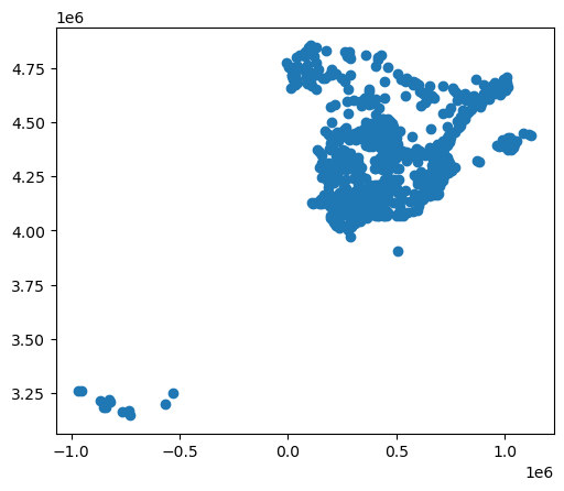
Adding base layers from web sources#
Many single datasets lack context when displayed on their own. A common approach to alleviate this is to use web tiles, which are a way of quickly obtaining geographical context to present spatial data. In Python, we can use contextily to pull down tiles and display them along with our own geographic data.
We can begin by creating a map in the same way we would do normally, and then use the add_basemap command to, er, add a basemap:
ax = cities.plot(color="black")
cx.add_basemap(ax, crs=cities.crs);
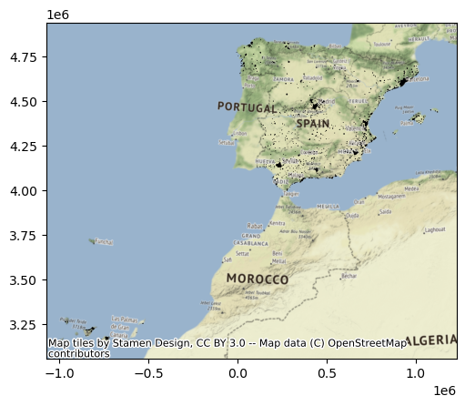
Note that we need to be explicit when adding the basemap to state the coordinate reference system (crs) our data is expressed in, contextily will not be able to pick it up otherwise. Conversely, we could change our data’s CRS into Pseudo-Mercator, the native reference system for most web tiles:
cities_wm = cities.to_crs(epsg=3857)
ax = cities_wm.plot(color="black")
cx.add_basemap(ax);
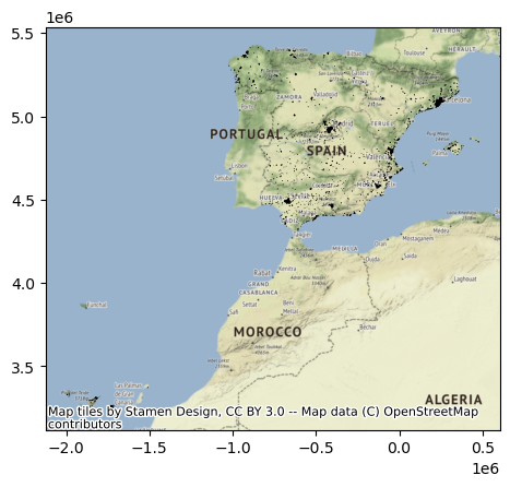
Note how the coordinates are different but, if we set it right, either approach aligns tiles and data nicely.
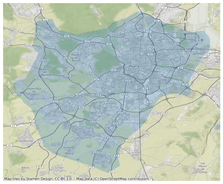
Web tiles can be integrated with other features of maps in a similar way as we have seen above. So, for example, we can change the size of the map, and remove the axis. Let’s use Madrid for this example:
f, ax = plt.subplots(1, figsize=(9, 9))
mad.plot(alpha=0.25, ax=ax)
cx.add_basemap(ax, crs=mad.crs)
ax.set_axis_off()
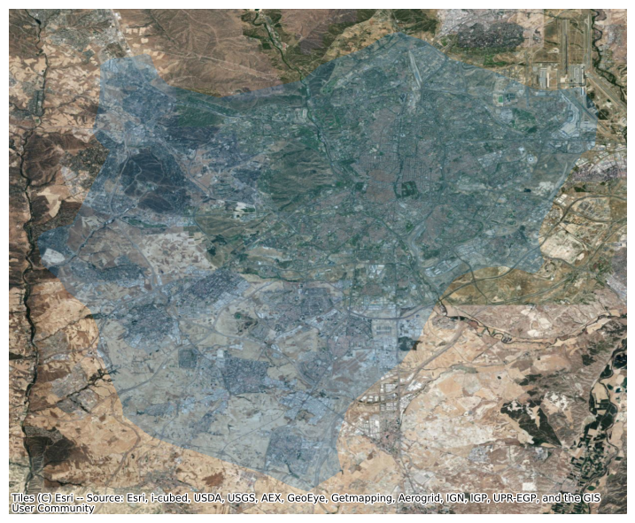
Now, contextily offers a lot of options in terms of the sources and providers you can use to create your basemaps. For example, we can use satellite imagery instead:
f, ax = plt.subplots(1, figsize=(9, 9))
mad.plot(alpha=0.25, ax=ax)
cx.add_basemap(
ax,
crs=mad.crs,
source=cx.providers.Esri.WorldImagery
)
ax.set_axis_off()
Have a look at this Twitter thread to get some further ideas on providers:
Terrain maps pic.twitter.com/VtN9bGG5Mt
— Dani Arribas-Bel (@darribas) August 2, 2019
And consider checking out the documentation website for the package:
Interactive maps#
Everything we have seen so far relates to static maps. These are useful for publication, to include in reports or to print. However, modern web technologies afford much more flexibility to explore spatial data interactively.
We will use the state-of-the-art Leaflet integration into geopandas. This integration connects GeoDataFrame objects with the popular web mapping library Leaflet.js. In this context, we will only show how you can take a GeoDataFrame into an interactive map in one line of code:
# Display interactive map
streets.explore()
Further resources#
More advanced GIS operations are possible in geopandas and, in most cases, they are extensions of the same logic we have used in this document. If you are thinking about taking the next step from here, the following two operations (and the documentation provided) will give you the biggest “bang for the buck”:
Spatial joins
Spatial overlays