Visualising Tabular Data
%matplotlib inline

import pandas
import seaborn as sns
import matplotlib.pyplot as plt
Assuming you have the file downloaded on the path ../data/:
db = pandas.read_csv("../data/paris_abb.csv.zip")
If you’re online, you can do:
db = pandas.read_csv("https://github.com/darribas/data_science_studio/raw/master/content/data/paris_abb.csv.zip")
Simple & Quick (pandas)
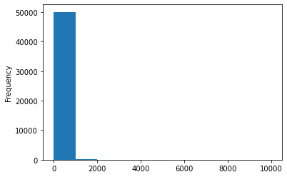
db["Price"].plot.hist()
<AxesSubplot:ylabel='Frequency'>
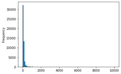
db["Price"].plot.hist(bins=100)
<AxesSubplot:ylabel='Frequency'>
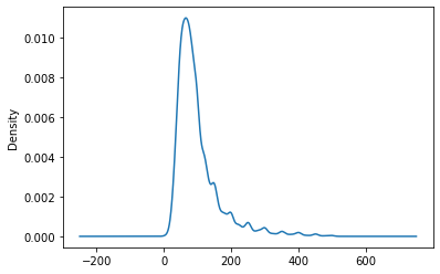
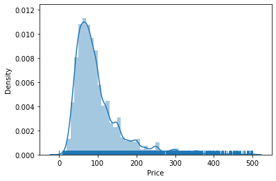
db.query("Price < 500")["Price"].plot.kde()
<AxesSubplot:ylabel='Density'>
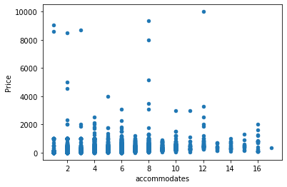
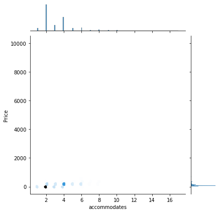
db.plot.scatter("accommodates", "Price")
<AxesSubplot:xlabel='accommodates', ylabel='Price'>
EXERCISE
Create a histogram of the distribution of number of people a property accommodates (
accommodates)Create a scatter plot of the number of beds and number of bedrooms
More
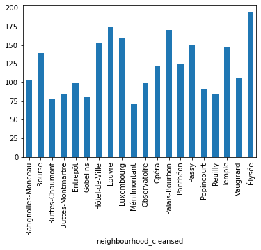
We can also combine this with groupings from the previous notebook:
db.groupby("neighbourhood_cleansed")\
  ["Price"]\
  .mean()\
  .plot.bar()
<AxesSubplot:xlabel='neighbourhood_cleansed'>
EXERCISE
Create a bar plot of the average review_scores_rating by neighbourhood, sorted by average price.
For a “pro” touch (optional), substract 90 from the reviews score before plotting.
seaborn
Univariate
sns.distplot(db.query("Price < 500")["Price"],
             kde=True,
             rug=True)
/opt/conda/lib/python3.8/site-packages/seaborn/distributions.py:2551: FutureWarning: `distplot` is a deprecated function and will be removed in a future version. Please adapt your code to use either `displot` (a figure-level function with similar flexibility) or `histplot` (an axes-level function for histograms).
  warnings.warn(msg, FutureWarning)
/opt/conda/lib/python3.8/site-packages/seaborn/distributions.py:2055: FutureWarning: The `axis` variable is no longer used and will be removed. Instead, assign variables directly to `x` or `y`.
  warnings.warn(msg, FutureWarning)
<AxesSubplot:xlabel='Price', ylabel='Density'>
Bivariate
sns.jointplot(x = "accommodates",
              y = "Price",
              data=db,
              kind="hex"
             );
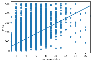
sns.regplot(x = "accommodates",
            y = "Price",
            data=db.query("Price < 500")
           );
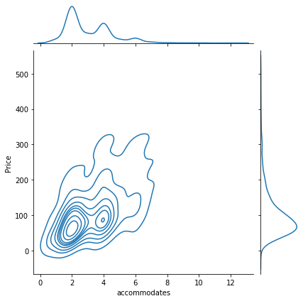
sns.jointplot(x = "accommodates",
              y = "Price",
              data=db.query("Price < 500")\
                     .sample(1000),
              kind="kde"
             );
EXERCISE
Explore the documentation of jointplot and create a figure similar to the one above where you replace the hexagonal binning for a KDE. Since this will probably take too long, subset your data before plotting to only properties cheaper than $500, and then randomly sample 1,000 observations (tip: check out the sample method).
More
Categorical
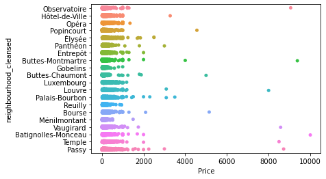
sns.stripplot(x = "Price",
              y = "neighbourhood_cleansed",
              data=db
             );
sns.swarmplot(x = "room_type",
              y = "Price",
              data=db.query("neighbourhood_cleansed == 'Louvre'")\
                     .sample(250),
              alpha=0.25
             );
/opt/conda/lib/python3.8/site-packages/seaborn/categorical.py:1296: UserWarning: 58.3% of the points cannot be placed; you may want to decrease the size of the markers or use stripplot.
  warnings.warn(msg, UserWarning)
To note:
With larger datasets, it’s hard to see any pattern
This is true even if you jitter the points around to avoid overlap and/or you play with transparency (
alpha)Algorithms to separate out dots exist but they’re computationally intensive and can only do so much
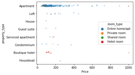
sns.stripplot(x = "Price",
              y = "property_type",
              hue = "room_type",
              data=db.query("neighbourhood_cleansed == 'Louvre'")\
                     .sample(250),
              alpha=0.25
             );
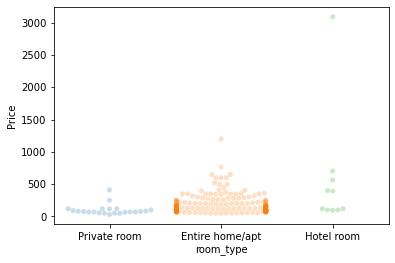
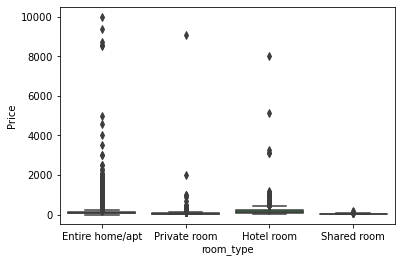
sns.boxplot(x = "room_type",
            y = "Price",
            data = db
           );
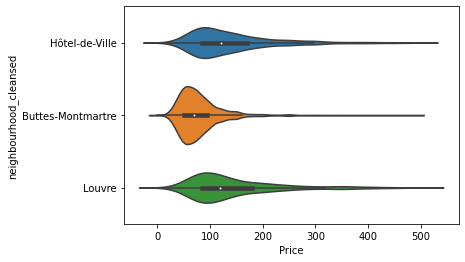
nei_list = ["Hôtel-de-Ville", "Louvre", "Buttes-Montmartre"]
sub = db["neighbourhood_cleansed"].isin(nei_list)

sns.violinplot(x = "Price",
               y = "neighbourhood_cleansed",
               data = db[sub].query("Price < 500")
              );
EXERCISE
Explore the distribution of price by property type
Full control (matplotlib)
One
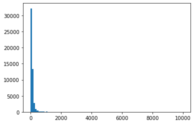
f, ax = plt.subplots(1)

ax.hist(db['Price'], bins=100)

plt.show()
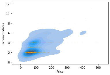
sub = db.query("Price < 500")\
        .sample(1000)

f, ax = plt.subplots(1)

sns.kdeplot(sub['Price'], sub['accommodates'],
            shade=True, ax=ax)
ax.scatter(sub['Price'], sub['accommodates'],
           alpha=0.1, s=0.75, color='orange')

plt.show()
/opt/conda/lib/python3.8/site-packages/seaborn/_decorators.py:36: FutureWarning: Pass the following variable as a keyword arg: y. From version 0.12, the only valid positional argument will be `data`, and passing other arguments without an explicit keyword will result in an error or misinterpretation.
  warnings.warn(
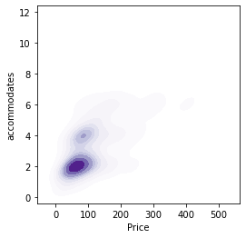
f, ax = plt.subplots(1, figsize=(4, 4))

sns.kdeplot(sub['Price'],
            sub['accommodates'],
            shade=True, ax=ax, cmap='Purples')

plt.show()
/opt/conda/lib/python3.8/site-packages/seaborn/_decorators.py:36: FutureWarning: Pass the following variable as a keyword arg: y. From version 0.12, the only valid positional argument will be `data`, and passing other arguments without an explicit keyword will result in an error or misinterpretation.
  warnings.warn(
CHALLENGE - Create a visualisation that includes a KDE and a scatter plot and that explores the relationship between number of beds and number of people it accommodates, for a random sample of 500 properties.
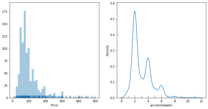
Two or more
f, axs = plt.subplots(1, 2, figsize=(12, 6))

sns.distplot(sub['Price'],
             kde=False,
             rug=True,
             ax=axs[0]
            )

sns.distplot(sub['accommodates'],
             hist=False,
             kde=True,
             rug=True,
             ax=axs[1]
            )

plt.show()
/opt/conda/lib/python3.8/site-packages/seaborn/distributions.py:2551: FutureWarning: `distplot` is a deprecated function and will be removed in a future version. Please adapt your code to use either `displot` (a figure-level function with similar flexibility) or `histplot` (an axes-level function for histograms).
  warnings.warn(msg, FutureWarning)
/opt/conda/lib/python3.8/site-packages/seaborn/distributions.py:2055: FutureWarning: The `axis` variable is no longer used and will be removed. Instead, assign variables directly to `x` or `y`.
  warnings.warn(msg, FutureWarning)
/opt/conda/lib/python3.8/site-packages/seaborn/distributions.py:2551: FutureWarning: `distplot` is a deprecated function and will be removed in a future version. Please adapt your code to use either `displot` (a figure-level function with similar flexibility) or `kdeplot` (an axes-level function for kernel density plots).
  warnings.warn(msg, FutureWarning)
/opt/conda/lib/python3.8/site-packages/seaborn/distributions.py:2055: FutureWarning: The `axis` variable is no longer used and will be removed. Instead, assign variables directly to `x` or `y`.
  warnings.warn(msg, FutureWarning)
CHALLENGE - Create a visualisation for all of the properties with three subplots:
Histogram of price
Scatter plot of price Vs number of people it accommodates
Histogram of number of people the property accommodates