Geographic Data Science
Visualization of PPs
Three routes (today):
- One-to-one mapping ↔︎ “Scatter plot”
- Aggregate ↔︎ “Histogram”
- Smooth ↔︎ KDE
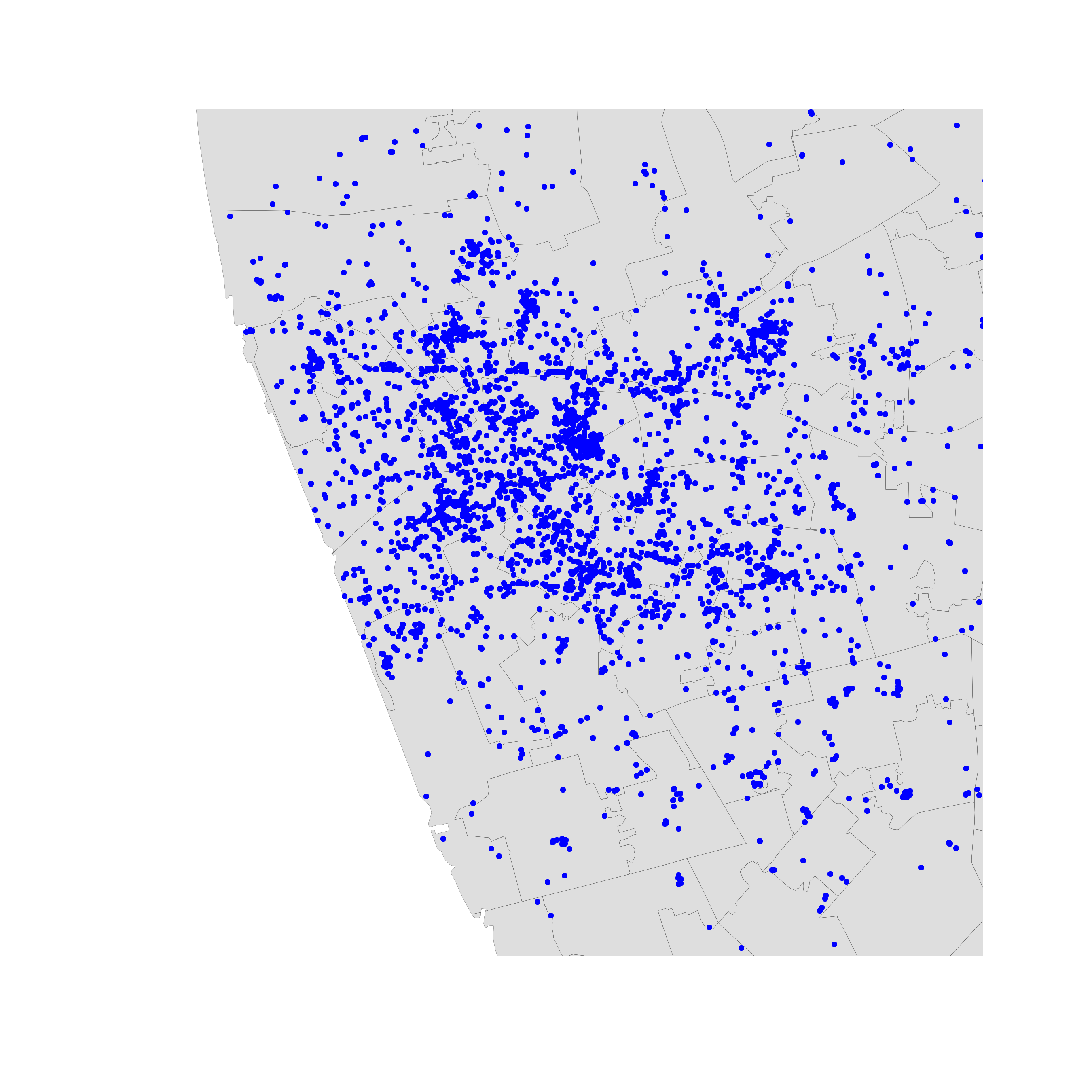
One-to-one
One-to-one
- Intuitive
- Effective in small datasets
- Limited as size increases until useless
One-to-one
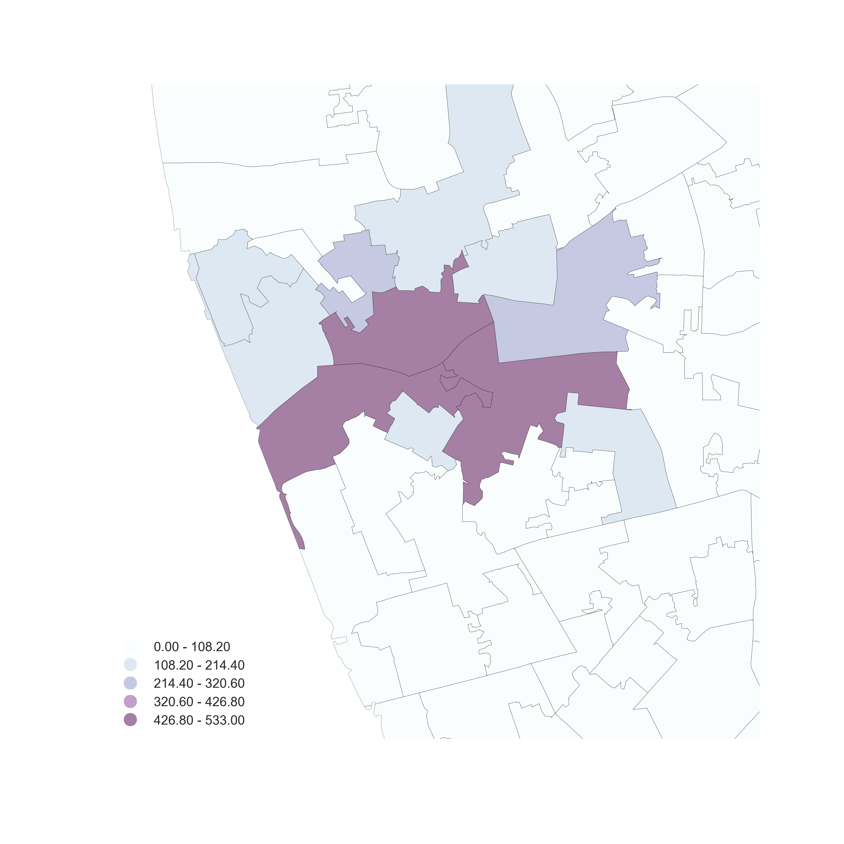
Aggregation
Use polygon boundaries and count points per area
[Insert your skills for choropleth mapping here!!!]
But, the polygons need to “make sense” (their delineation needs to relate to the point generating process)
Hex-binning
If no polygon boundary seems like a good candidate for aggregation…
…draw a hexagonal (or squared) tesselation!!!
Hexagons…
- Are regular
- Exhaust the space (Unlike circles)
- Have many sides (minimize boundary problems)
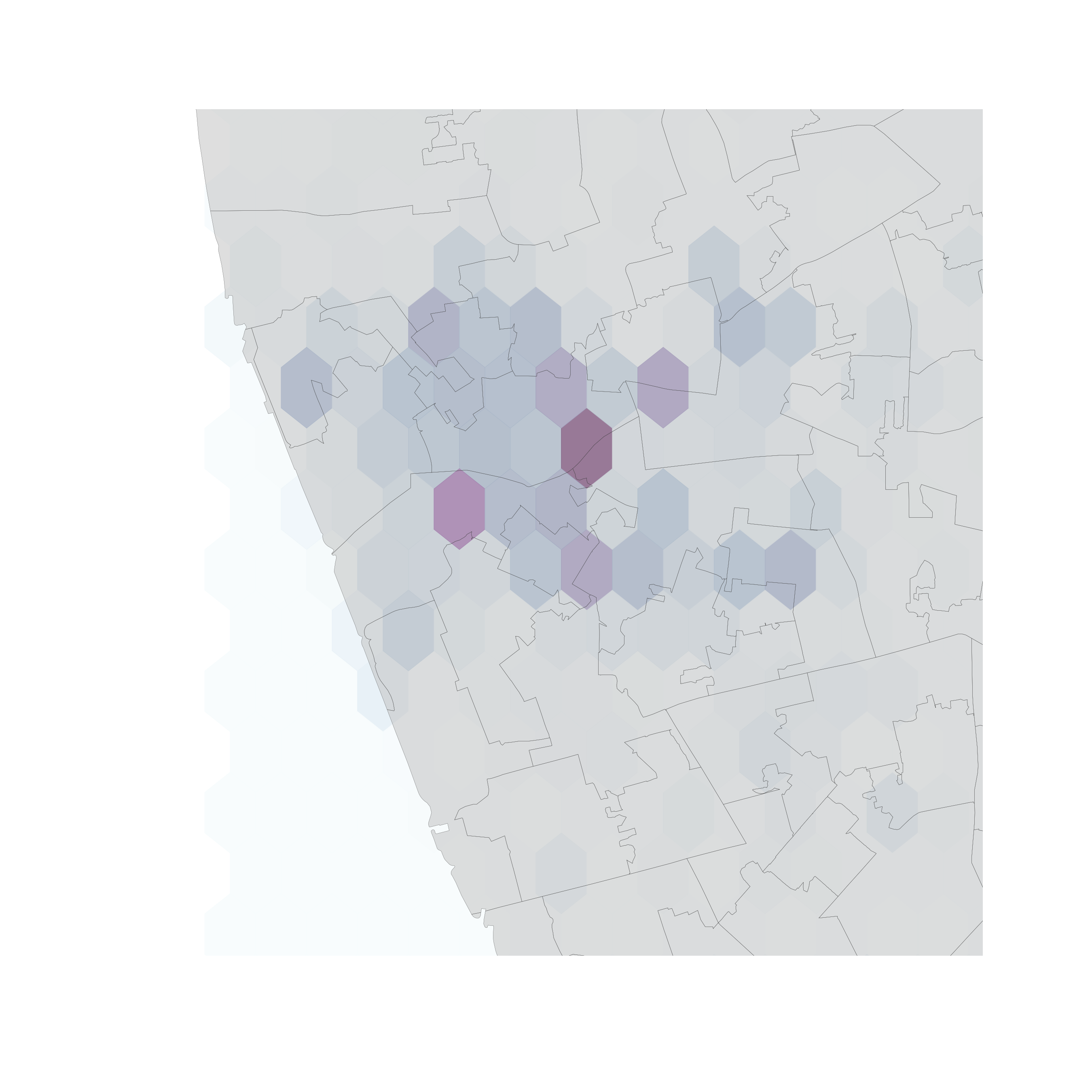
But…
(Arbitrary) aggregation may induce MAUP (see Block D)
Points usually represent events that affect only part of the population and hence are best considered as rates
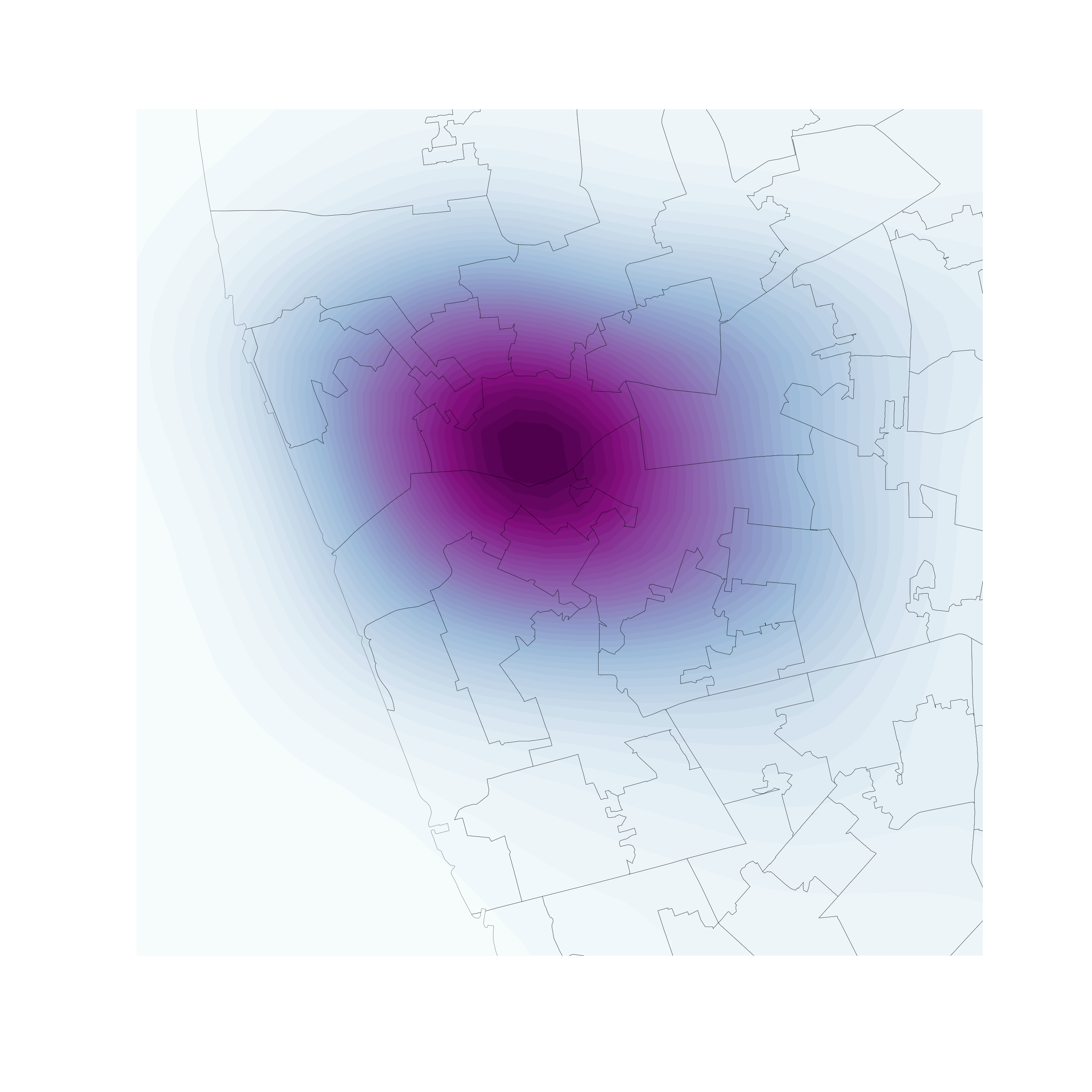
Kernel Density Estimation
Kernel Density Estimation
Estimate the (continuous) observed distribution of a variable
- Probability of finding an observation at a given point
- “Continuous histogram”
- Solves (much of) the MAUP problem, but not the underlying population issue
[Source]
Bivariate (spatial) KDE
Probability of finding observations at a given point in space
- Bivariate version: distribution of pairs of values
- In space: values are coordinates (XY), locations
- Continuous “version” of a choropleth

A course on Geographic Data Science by Dani Arribas-Bel is licensed under a Creative Commons Attribution-ShareAlike 4.0 International License.