Levelling Up & Moran's I
February 3, 2022
This text was originally posted as a Twitter thread
Plenty of folks better placed to deliver hot takes so I’ll spare you mine… But, by my own account, the most statistically sophisticated fig in the full #levellingupwhitepaper is one on spatial stats(!). Gist: not wrong, not right either, but definitely cool!

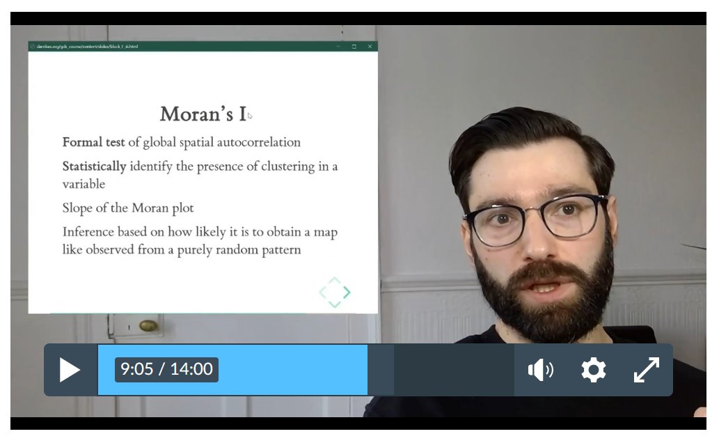
The plot shows Moran’s I vs deprivation prevalence in Local Authorities. What’s Moran’s I? I’m glad you asked, this is a staple of Geographic #DataScience and spatial analysis courses alike (like mine! https://darribas.org/gds_course/. Moran’s I measures global spatial autocorrelation, capturing the degree to which values concentrate spatially. For a bit more on spatial autocorrelation, here’s me in my living room last year explaining pandemic-distanced students what it is in <10min:

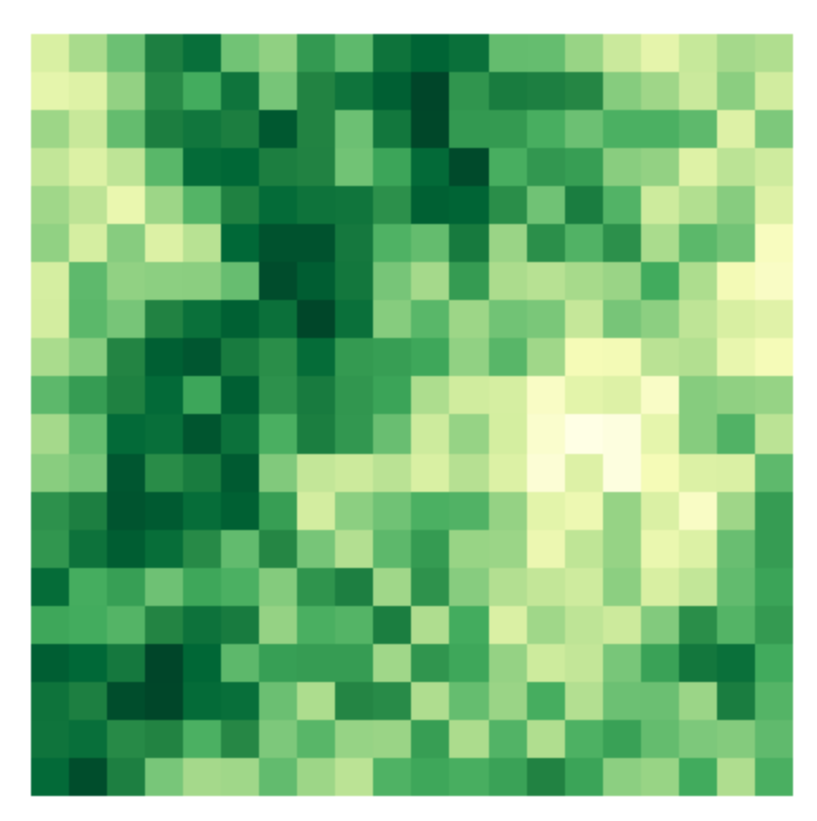
Moran’s I is also a way to “summarise a map” in that it assigns a value to a pattern of spatial concentration. Your map looks like this? Moran’s I is high and approaching 1…
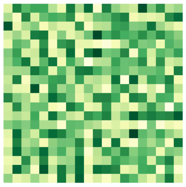
Your map looks like this? Moran’s I will be low and approaching -1…
By the way, these figures are created using a small simulation toolLaunch it on the cloud from
here.

@mybinderteam for the awesome infrastructure powering
this! I
wrote to help students grasp the intuition behind the statistic, and
you too can play with it! For a 14 minute version of what is Moran’s I and why you should love it, welcome back to my living room!
This brings me back to Figure 1.23 in yesterday’s white paper, which took me a bit to decipher because it uses Moran’s I in a non-standard way. The point it’s trying to make is that cities w/ more income deprived population tend to display deprivation more spatially concentrated. This is an interesting pattern because it is saying that cities with more deprivation are also different in the way the deprivation is structured spatially (ie. more deprivation is related to more fundamental changes in how this is spatially configured).
But while the graph is not wrong… it is also not entirely correct. It is well understood that Moran’s I scores (the statistic itself, which is on the vertical axis of the figure) are not directly comparable across different geographies. The reason is a bit technical, but has to do with comparing different sample sizes and spatial configurations of values. A topic for another thread perhaps… More importantly, Moran’s I is not that useful as a deterministic statistic, as a score. A value of 0.3 can mean something very different in two different local authorities. This has to do again with the underlying assumptions of the statistic, but mostly because in some cases we will have enough evidence to say that value points to spatial concentration and, in others, it will be indistinguishable from a completely spatially random map. I’d have probably used any visual cue (eg. dimming non-significant values) to emphasize this aspect and bring more nuance to the figure.
Again, let me repeat the figure is not wrong. Using raw Moran’s I scores to gauge broad patterns is a sensible strategy to explore your data. Whether I’d choose to include the figure as it is on a final report is a different question…
So, to wrap up, although there are always ways to improve, I think it is awesome that policy makers are using these tools to inform their views on the world the decide on. This will be a very good example for prospective geography students on why they should take my numbers course even though what they really want is to “make a difference in politics”! Could it be improved the way these statistics are used in policy? Of course, but that is as much a job of policy makers as it is for us academics and data scientists “in the know”. The solution is not to remove the figure, but to have more of them, and to generate discussion around it so, over time, we all collectively get better at using data and stats for big policy “things”.
And that’s a wrap! If the nerdy bits of this post peeked your interest, consider spending a bit more time on the course websitehttps://darribas.org/gds_course or on the YouTube playlistYouTube Playlist ! See you on the next big policy paper that uses spatial stats!