Lab 7 - Interactivity
In this lab, we are going to get our hands dirty and play with different elements that allow us to make a map interactive. We will do so using CARTO, which makes possible (and even fun!) to work interactivity into a map in different ways.
As we go through the hands-on aspect of this block, please keep the lecture slides handy and revisit them as much as you need to. As always, the real challenge is not to learn how to use a piece of software, but how to apply conceptual notions in a practical context.
To complete this lab, you will require the following:
- The internet
- An active CARTO account
CARTO
We will use CARTO to quickly be able to make web maps and explore how you can build interactivity in web maps.
Let us start by logging into CARTO:
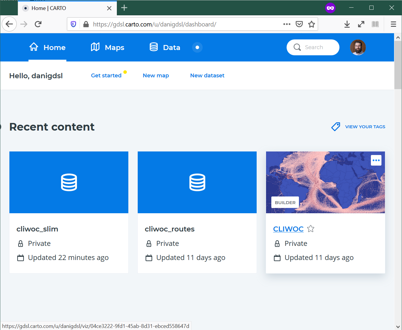
Upon login, you should see a dashboard that looks more or less like:
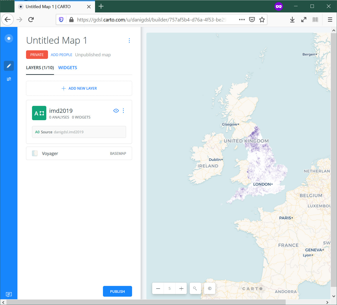
To see the main features, you can create a “New Map” (either from the dasboard or the “Maps” section, you will be able to find that button), and add the imd2019 dataset we used for Lab 6 (remember, you will find it on the “Shared with you” tab). This will take you to a new page that looks roughly like:
Explore the CARTO interface
We will use the 2019 IMD dataset, which has been uploaded to CARTO already.
Let’s walk through the basics of CARTO as a (web) GIS:
- Data section: upload the file
- Maps section
- New map
- Main/side pane
- Basemap: pick your background
- Main layer: focus on
stylefor nowSTYLEPOP-UPLEGEND
Interactivity
Now let’s remember the building blocks of interactivity we have learnt in the lecture:
- Filtering
- Pan
- Zoom
- Subset
- Perspective
- Volume
- Tooltips
- Split
- Animate
In bold those that we will work through in this lab.
To demonstrate animations, we will use another dataset we have enountered in the past, the CLIWOC ship logs:
https://figshare.com/articles/CLIWOC_Slim_and_Routes/11941224
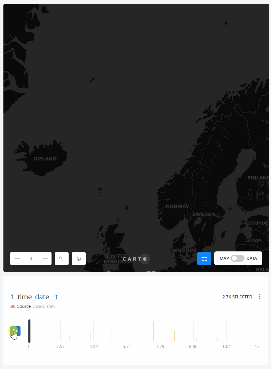
You should be able to find it also on your “Shared with you” section of the Data tab. We will work with individual logs (cliwoc_slim) to create an animation of the logs, for example grouping them by month, as in this example of expeditions into the North:
Exercise
Now we know the mechanics of interactivity in CARTO, let’s show off! Pick whichever you want first, and have a go at the following maps:
- An animation of global trade over time
- A map that lets you pick a given country and display its main routes
- A map that lets you identify the vesel ID (
id), date, and country of ships around Cape Town - A choropleth where you can select routes by their length in days
- An animation of each route in the region around Jakarta
- A map that allows you to select a single route, zoom into its origin, and then pan throughout the route
Once completed, select the one you like best, and post it on Teams.
Presentation
You will then have 30 seconds to present your favorite map and hit the following points:
- What the map shows
- What interactivity element(s) you have used
- One thing you think is really effective about it
Remember, 30 seconds. Short and sweet. Make them count!
This work is licensed under a Creative Commons Attribution-ShareAlike 4.0 International License.
