Geographic Data Science - Lecture IV
Mapping Data
Dani Arribas-Bel
Today
- Visualisation
- Geo-Visualisation
- Mapping data
- MAUP
- Choropleths
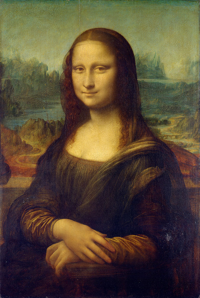
Visualization
The Visual Display of Quantitative Information. Edward R. Tufte.
[Source]
Visualization
- By encoding information visually, they allow to present large amounts of numbers in a meaninful way.
- If well made, visualizations provide leads into the processes underlying the graphic.
The Visual Display of Quantitative Information. Edward R. Tufte.
Geovisualization
Tufte (1983)
MacEachren (1994)
GeoVisualization
- Not to replace the human in the loop, but to augment her/him.
- Augmentation through engaging the pattern recognition capabilities that our brain inherently has.
- Combines cartography, infovis and statistics
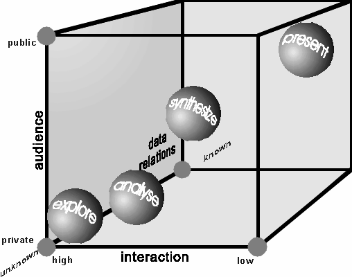
A map for everyone
Maps can fulfill several needs, looking very different depending on the end-goal
MacEachren & Kraak (1997) identify three main dimensions:
- Knowledge of what is being plotted
- Target audience
- Degree of interactivity
MacEachren & Kraak (1997) map cube
[Source]
Making good data maps
- “Containers”
- Choropleths
Data “containers”
Modifiable Areal Unit Problem (Openshaw, 1984)
MAUP
Scale and delineation mismatch between:
- Underlying process (e.g. individuals, firms, shops)
- Unit of measurement (e.g. neighborhoods, regions, etc.)
In some cases, it can seriously mislead analysis on aggregated data (e.g. Flint, MI!!!)
Always keep MAUP in mind when exploring aggregated data!!!
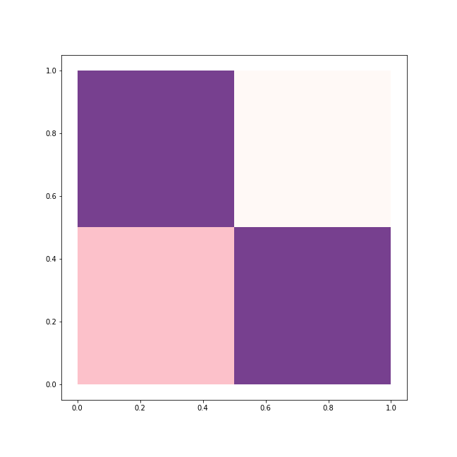
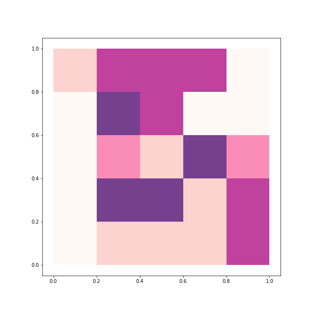
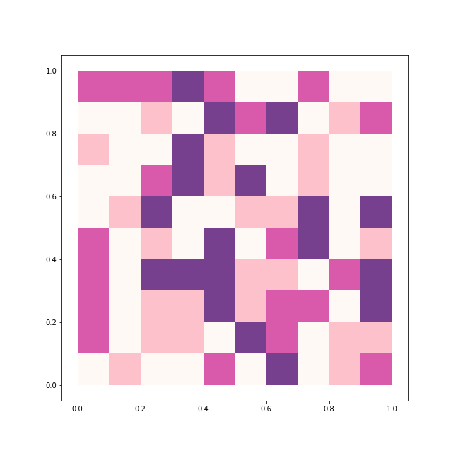
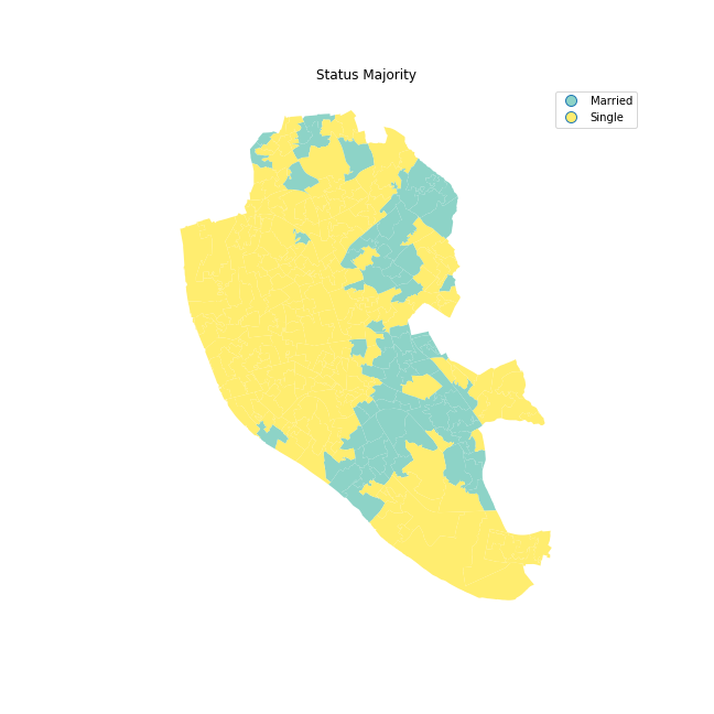
Choropleths
Choropleths
- Counterpart of the histogram
- Values are classified into specific colors: value –> bin
- Information loss as a trade off for simplicity
Classification choices
- N. of bins
- How to bin?
- Colors
How many bins?
- Trade-off: detail Vs cognitive load
- Exact number depends on purpose of the map
- Usually not more than 12
How to bin?
Unique values
- Categorical data
- No gradient (reflect it with the color scheme!!!)
- Examples: Religion, country of origin…
Unique values
Equal interval
- Take the value span of the data to represent and split it equally
- Splitting happens based on the numerical value
- Gives more weight to outliers if the distribution is skewed
Quantiles
- Regardless of numerical values, split the distribution keeping the same amount of values in each bin
- Splitting based on the rank of the value
- If distribution is skewed, it can put very different values in the same bin
Other
- Fisher-Jenks
- Natural breaks
- Outlier maps: box maps, std. maps…
Color schemes
Align with your purpose
- Categories, non-ordered

- Graduated, sequential

- Graduated, divergent

TIP: check ColorBrewer for guidance
Tips
- Think of the purpose of the map
- Explore by trying different classification alternatives
- Combine (Geo)visualisation with other statistical devices

Geographic Data Science’19 by Dani Arribas-Bel is licensed under a Creative Commons Attribution-ShareAlike 4.0 International License.