Geographic Data Science - Lecture III
(Geo-)Visualization
Dani Arribas-Bel
Today
Visualization
- What and why
- History
- Examples
Geovisualization
- What
- "A map for everyone"
- Dangers of geovisualization
Visualization
[Source]
A bit of history
- Surprisingly recent: 1750-1800 approx. (much later than many other advances in math and stats!)
- William Playfair's "linear arithmetic": encode/replace numbers in tables into visual representations.
- Other relevant names throughout history: Lambert, Minard, Marey.
Visualization
The Visual Display of Quantitative Information. Edward R. Tufte.
- By encoding information visually, they allow to present large amounts of numbers in a meaninful way.
- If well made, visualizations provide leads into the processes underlying the graphic.
Learning by seeing time...
Time series
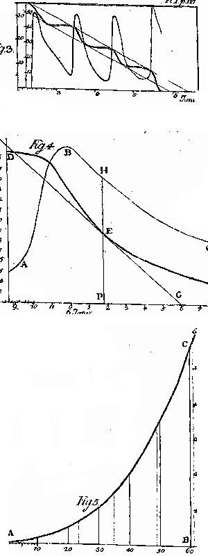
[Source] XVIIIth. Cent. - Pytometrie by J. H Lambert
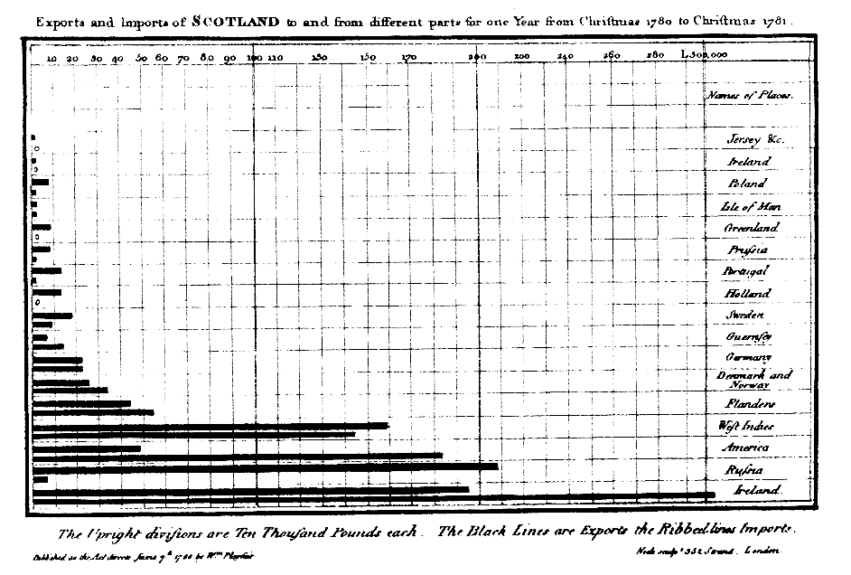
Bar chart
[Source] Playfair's bar chart in The Commercial and Political Atlas (1786)
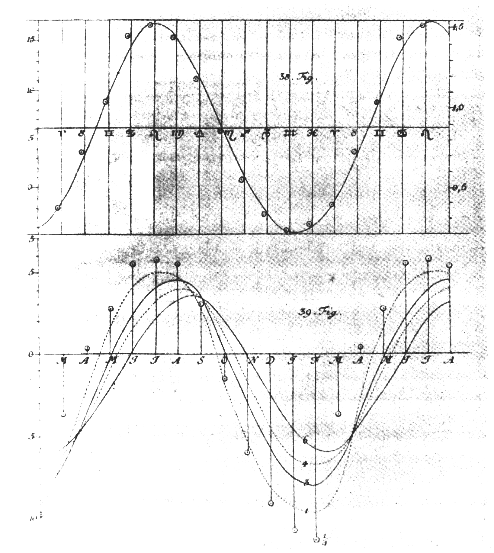
Abstract line plot
[Source] Lambert - Evaporation rate against temperature, 1769
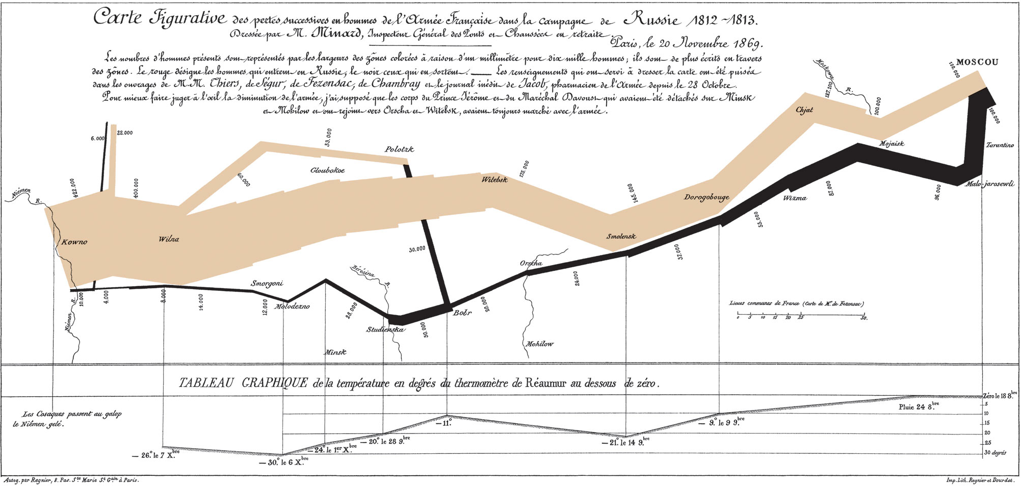
Minard - Napoleon army map (XIXth. Cent.)
[Source] "It may well be the best statistical graphic ever drawn" (E. R. Tufte)
Geovisualization
Tufte (1983)
MacEachren (1994)
GeoVisualization
- End goal is not to replace the human in the loop, but to augment her/him.
- Augmentation here comes through engaging the pattern recognition capabilities that our brain inherently has.
- Combines:
- Traditional maps
- Statistical maps
- Statistical devices of other kind (charts, scatter plots, etc.)
- Different roles in the analysis process...
A map for everyone
Maps can fulfill several needs
Depending on which one we want to stress, the best map will look very different
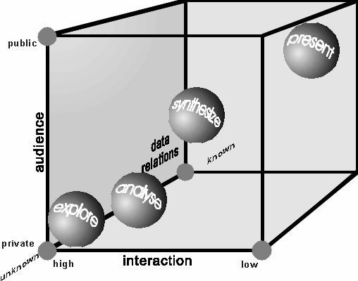
MacEachren & Kraak (1997) identify three main dimensions:
- Knowledge of what is being plotted
- Target audience
- Degree of interactivity
MacEachren & Kraak (1997) map cube
[Source]
Un/known: fast and slow maps
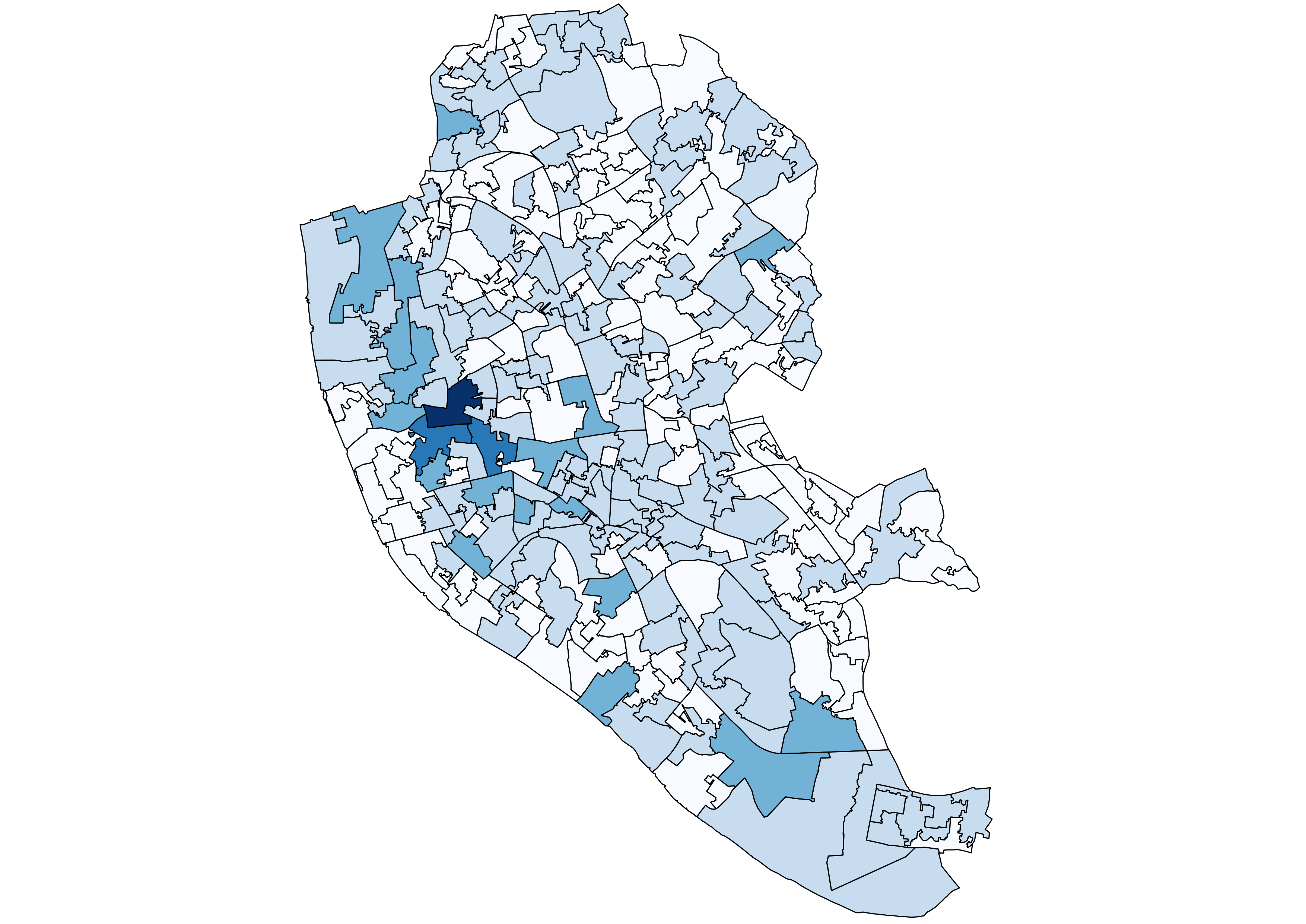
Fast maps
[Source]
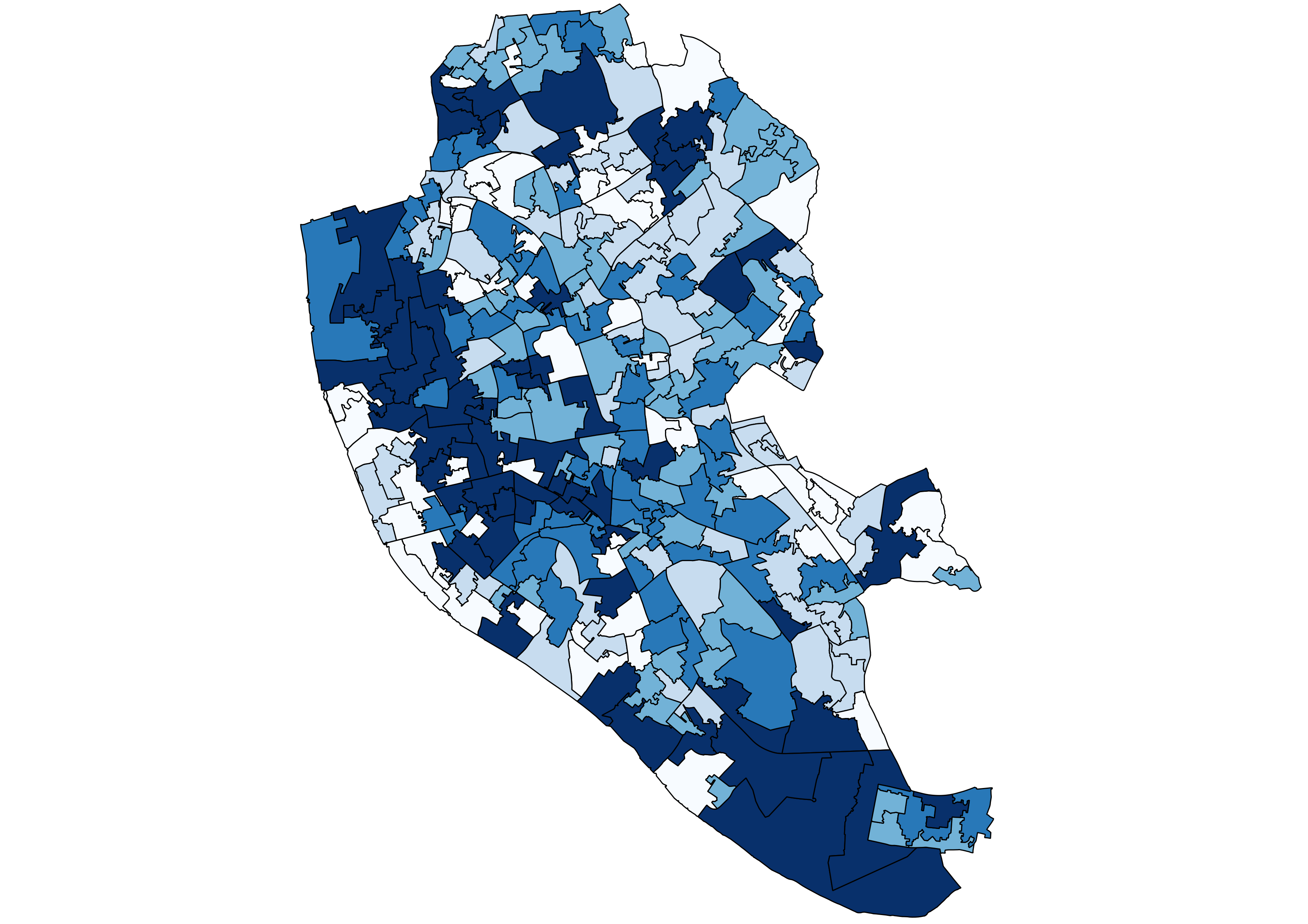
Slow maps
[Source]
Audience: easy and hard maps
Easy map
[Source] Map of same-sex marriage in the US, 2015

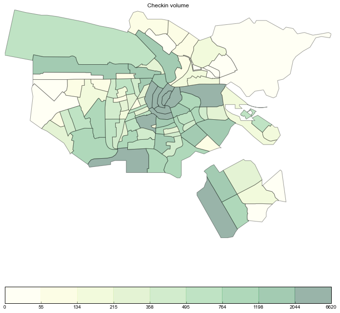
Hard map
[Source]
Interaction: one or many maps in one
Static map
Interactive map
Dangers of GeoVisualization
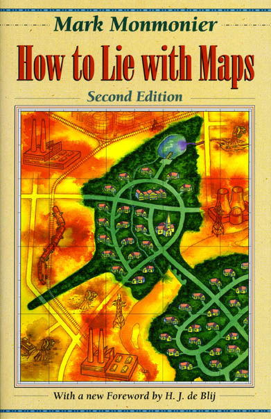
How to lie with maps
How to lie with maps
The human brain is so good a picking up patterns...
... that it finds them even where they don't exist!
Patternicity (Shermer, 2008) The tendencey to find meaningful patterns in meaningless noise
Apophenia (Konrad, 1958) The experience of seeing patterns or connections in random or meaningless data
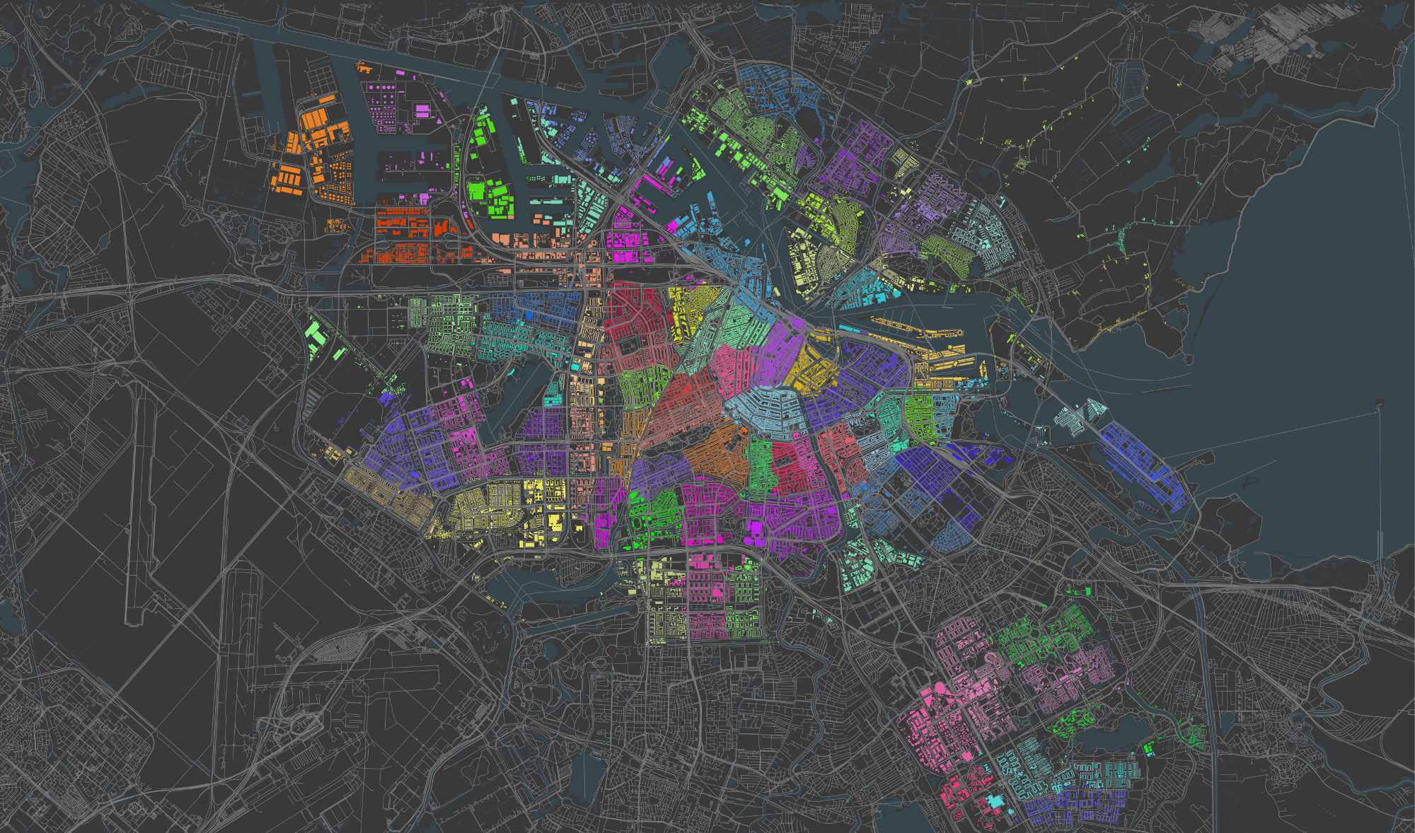
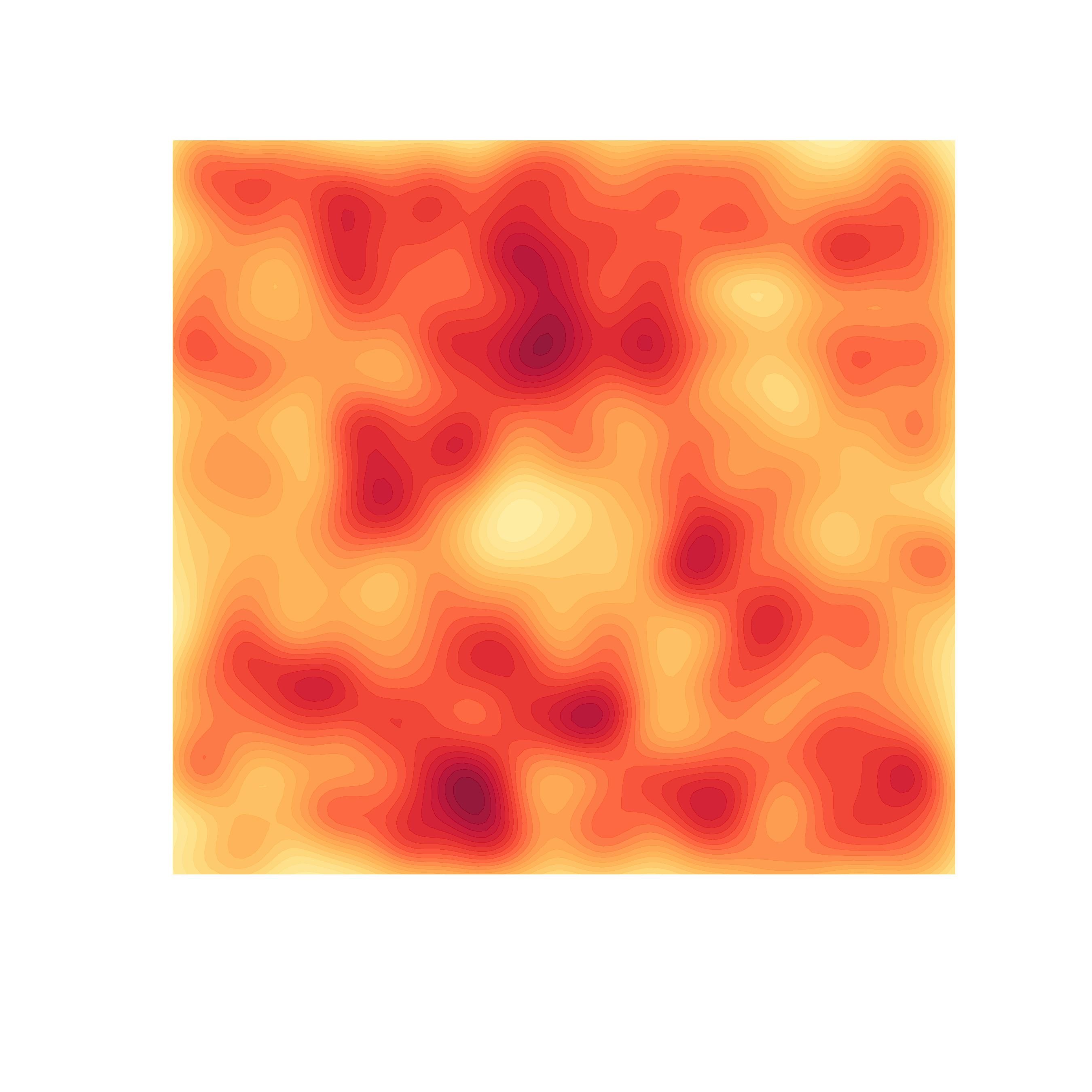
Twitter clusters
How to be truthful with maps
- Complement and enhance visuals
- Help disentangling true from spurious patterns (a.k.a. identifying the "Jesus on the toast")
- Reciprocity: GeoVis can also enhance statistics and make them more useful
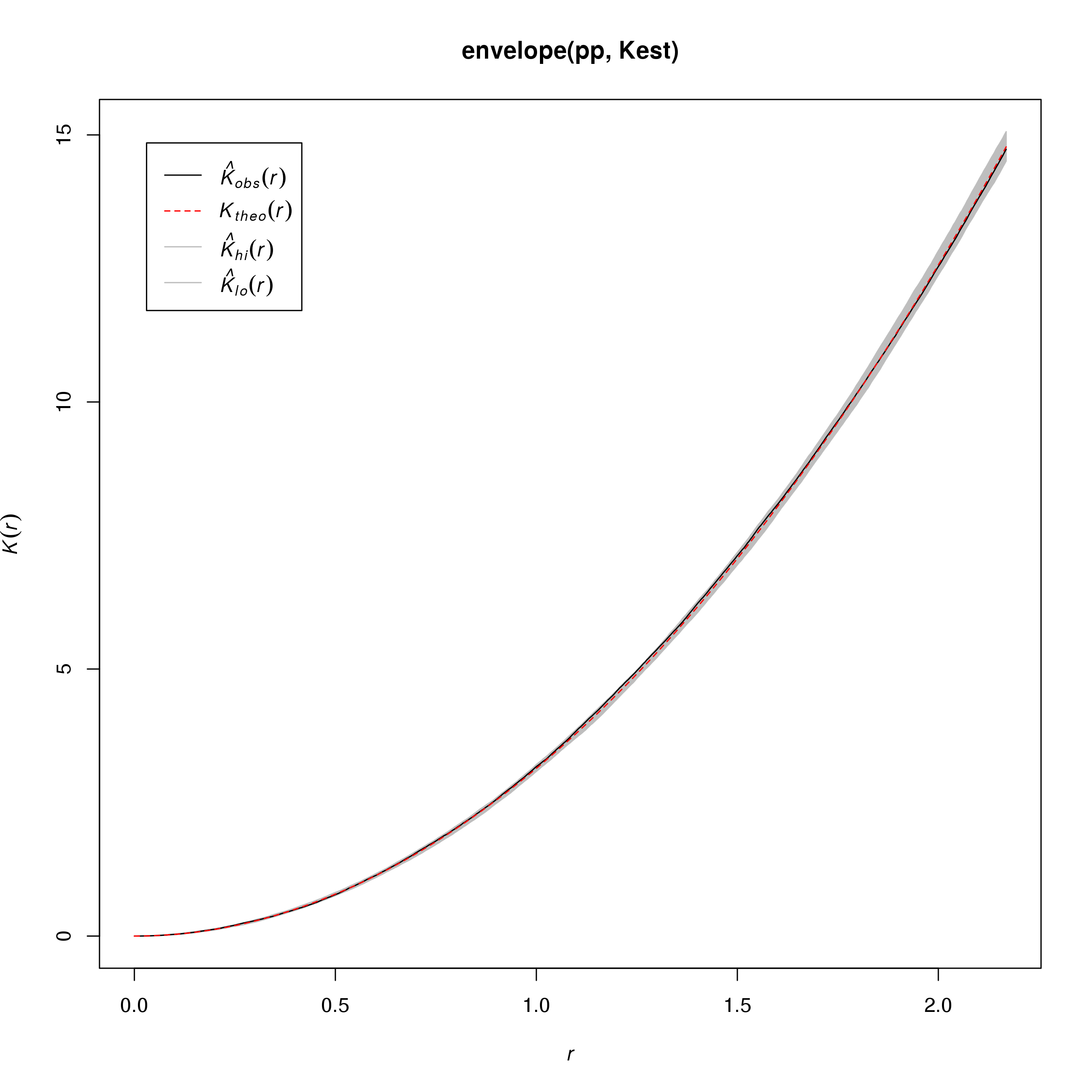
Statistics for Twitter clusters
Recapitulation
- Visualization of statistical data is a fairly recent phenomenon.
- Its power comes from engaging and augmenting the human in the loop, rather than replacing her/him.
- Its power can be misused, but there are methods to limit this risk.

Geographic Data Science'15 - Lecture 3 by Dani Arribas-Bel is licensed under a Creative Commons Attribution-NonCommercial-ShareAlike 4.0 International License.