Data mapping using QGIS
The following instructions are based on https://github.com/nickbearman/intro-qgis-spatial-data
Data
Ensure you have the following datasets downloaded:
- CDRC’s English Indices of Deprivation 2015 Geodata Pack for the city of Liverpool (UK).
- CDRC’s Geodata pack for the city of Liverpool (UK).
- Raster file for the basemap of Liverpool (tiff file).
Starting up QGIS
Open QGIS Desktop 2.10.1 (not the ‘with GRASS’ option).
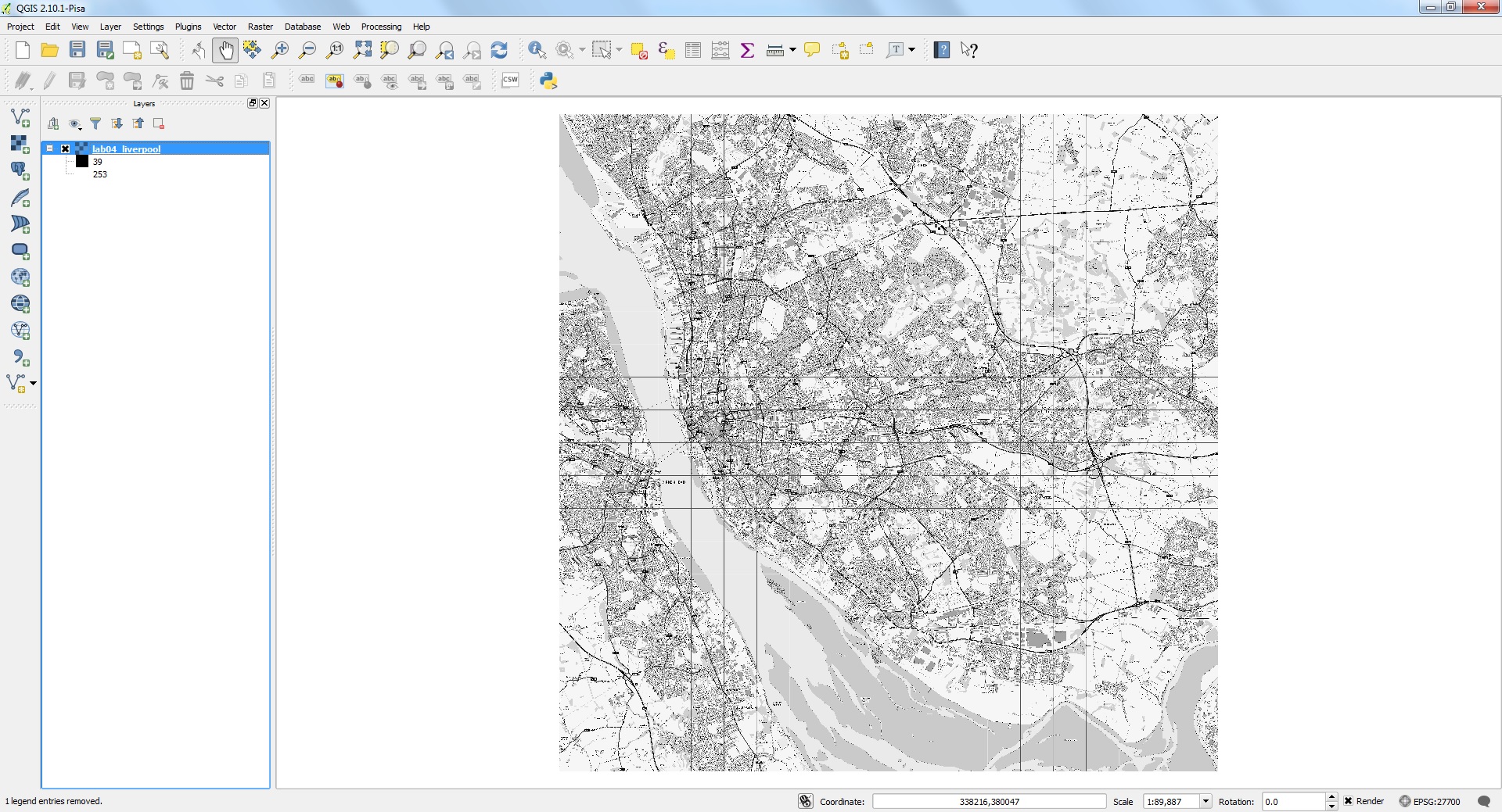
Add Raster basemap
- Layer > Add Layer > Add Raster Layer
- Browse
- Navigate to the lab04_liverpool.tiff in your file directory and click Open.
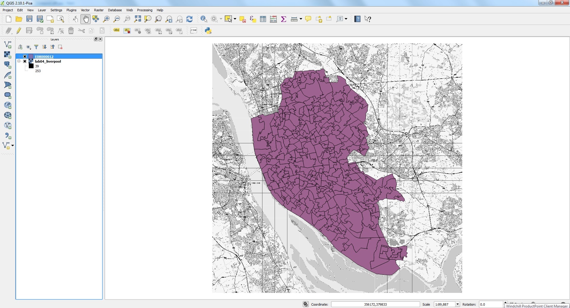
Add IMD dataset
- Layer > Add Layer > Add Vector Layer
- Browse
- Navigate to the E08000012.shp and Open.
- Ensure your E08000012 dataset overlays the Liverpool .tiff file.
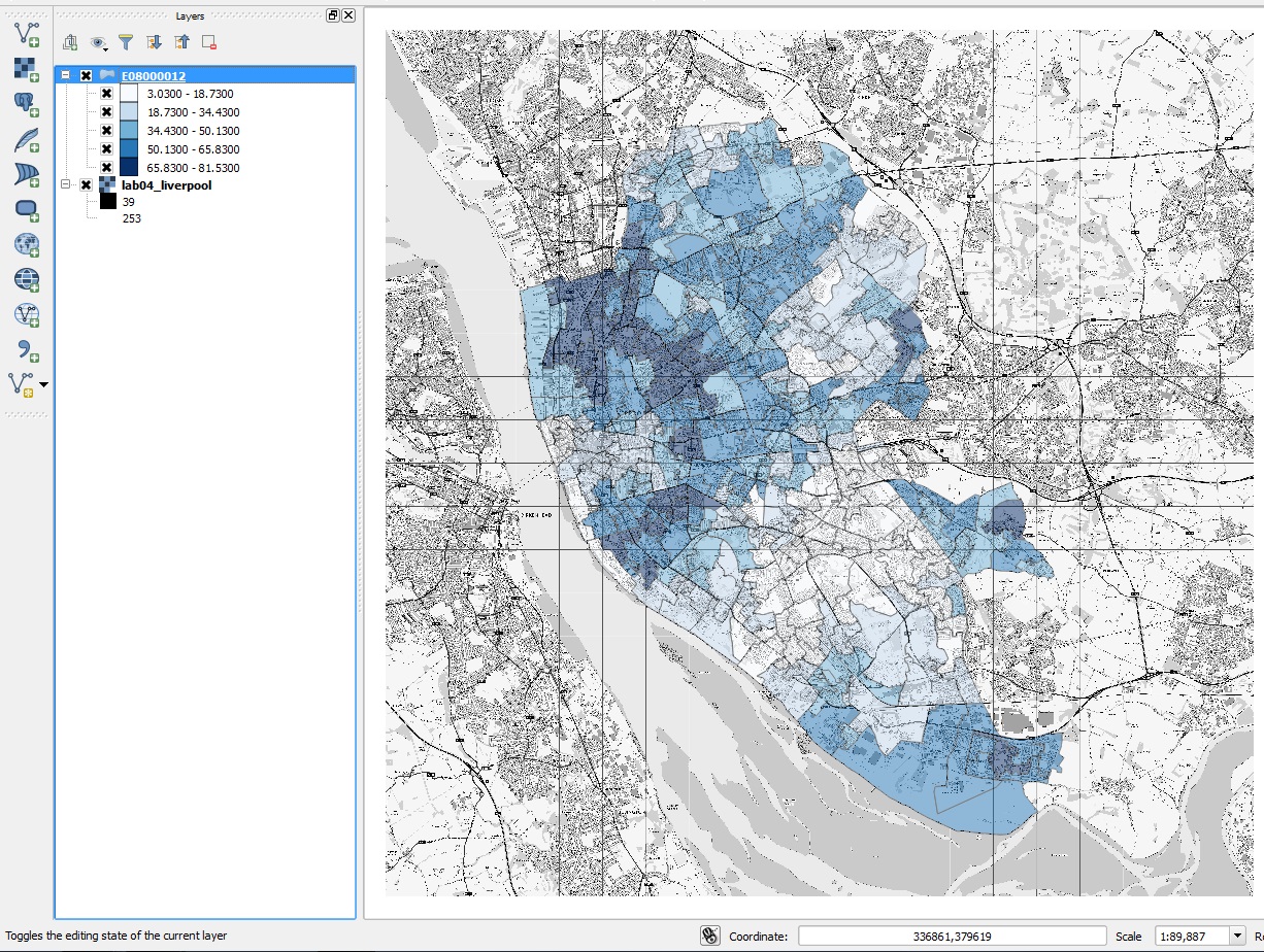
Visualising IMD dataset
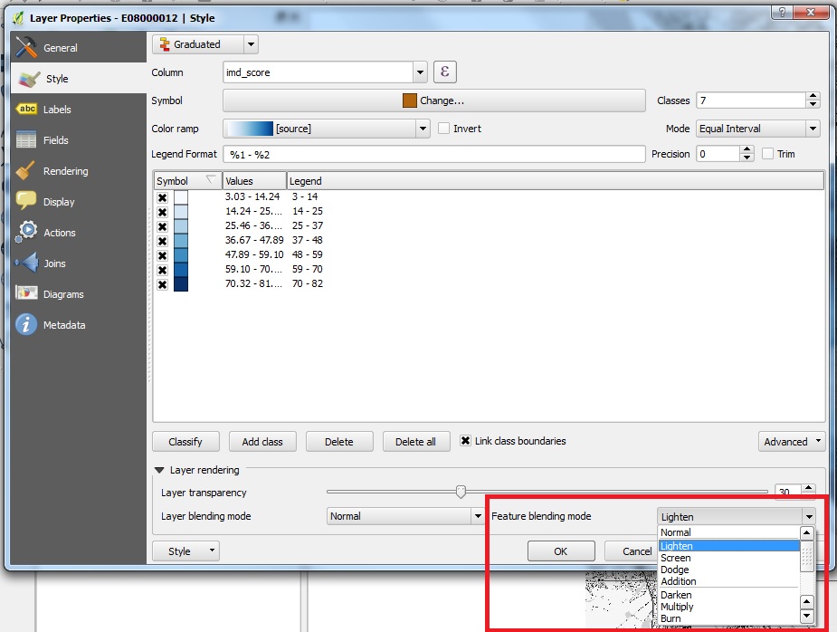
- Right click on E08000012 in the layer list (on the left of the QGIS window) and select Properties. In the Layer Properties window that appears, make sure that the Style tab on the left is selected. Click on the drop-down arrow to the right of Single Symbol (as shown below) and select Graduated.
- We will start by mapping imd_score: use the Column drop-down arrow to select imd_score. Click Classify to bring up the ranges of values. QGIS then assigns ranges of population values different colours/shades.
- Select your own colour ramp
- Change the transparency to 50
- Click Ok
Output
- Repeat with other measures available in the dataset e.g. employment, education or health.
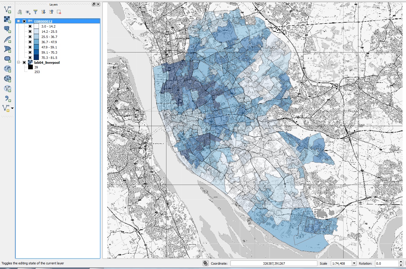
Change equal intervals
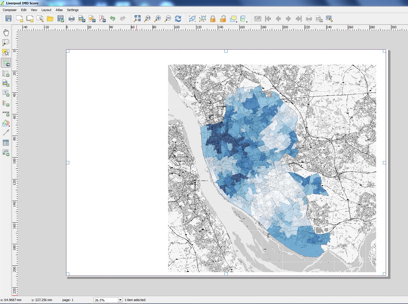
The number of equal intervals can be changed in the properties window. This changes the look and meaning of the map. 7 equal intervals for imd_score looks like this:
- Right click E08000012 and select Properties.
- Select Lighten under Feature Blending Mode to remove the border between each LSOA.
Presenting your map
- You can simply save your map as an image using Project > Save. However there are a few key elements missing such as a legend, scale bar and north arrow.
- Before you proceed. right click on E08000012 in the Layers view and select Zoom to Layer.
- Go to Project > New print composer.
- In the composer title window type: Index of Multiple Deprivation for Liverpool and click OK.
- In the composer window go to Layout > Add Map.
- Hold down on the left button on the mouse in the top left corner of the blank page on the screen and drag to the bottom right. Let go. Your map should appear on the page.
- Under Item Properties > Map > Main Properties (on the right hand side of the screen), change the Scale to 95000.
- To move the frame (the map and the box around it), go to Layout > Move Item; you can click the frame and move it about.
- To move just the map go to Layout > Move Content. You could move the map using this function to the right of the page, to allow space on the left for a legend and title.
Add a legend.
- Go to Layout > Add Legend.
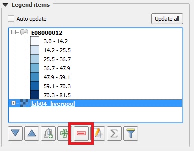
- Under Item Properties > Legend, deselect 'Autoupdate.' Remove the .tiff file from the legend.
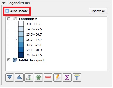
- Select lab04_liverpool (the raster layer) and select delete.
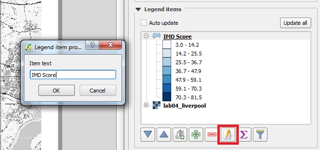
- Rename the Legend by selecting the pencil icon and typing 'IMD Score'
- ##### Add a scale bar.
- Go to Layout > Add Scale bar and left click on the map.
You can adjust the width of the scale bar in Item Properties > Scale bar > Segments > Fixed Width. Change to ~ 1000 units for a smaller scale bar.
##### Add a north arrow.
Go to Layout > Add arrow and click on the map.
Move the cartographic components on your map as you wish to create your final map.
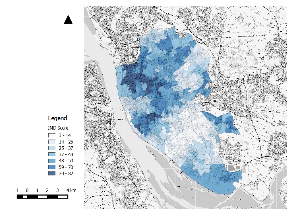
Once finished go to Composer > Export as image.
Written and tested using QGIS 2.10.1 on 02/11/2015 by Charlotte Lyddon.

Data mapping using QGIS by Charlotte Lyddon is licensed under a Creative Commons Attribution-NonCommercial-ShareAlike 4.0 International License.